Before and After
This recent project by LW Interiors is the foyer of the Union Building, a historic commercial building located in the heart of Newton Centre, a suburb right outside of Boston. The building is in the Union Street historic district of Newton Centre which encompasses the city’s only significant cluster of 19th century commercial buildings. There are five historic buildings consisting of three commercial buildings, the railroad station – the Newton Centre Station MBTA Green Line – and an apartment block on adjacent Herrick Street. The railroad station was designed by H.H. Richardson and finished around 1890 by his successor firm, Shepley, Rutan and Coolidge after his death. The station has the typical Richardson Romanesque style with brownstone and granite construction and an overhanging slate roof with arched eyebrow dormer windows. There was a freight building that was mostly demolished in 1985 with parts of it incorporated into new construction on the site. The original landscaping was done by the Olmsted Brothers, but it is not there now.
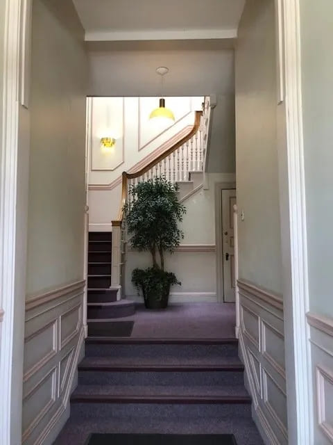
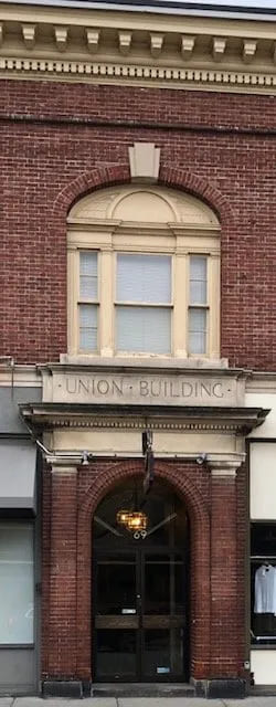
The Union Building was built in 1896 in the Georgian Revival style. At present there is a restaurant on one side and a clothing store on the other. In between the two is an entrance recessed behind an arch flanked by brick pilasters and a modillioned cornice with dentil molding. The entrance has a landing and a stairway that lead to four offices on the second floor. My office is one of the four in addition to a real estate office, a dental practice and an architectural firm. Shown above is the “before” picture of the foyer which was done about 30+ years ago. Below is the entrance to the lobby with all of the architectural detail. (All historic references from Wikipedia)
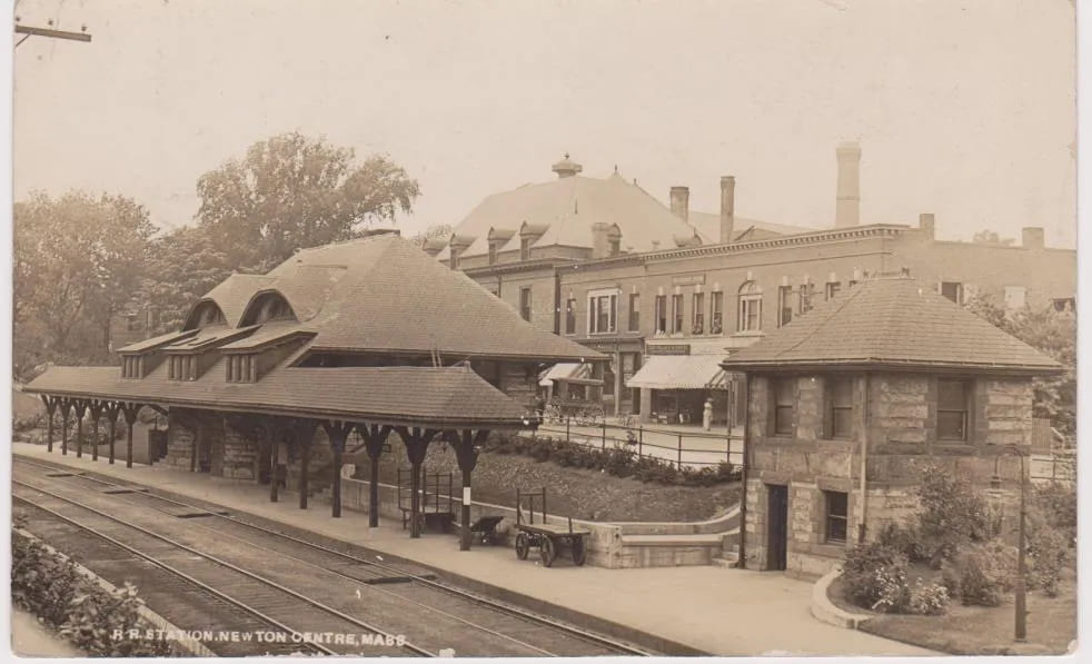
Here is a photo I obtained from the Newton Historic Society. It was taken in 1906 after the MBTA tracks were lowered. The Union Building sits right across the street from the Newton Centre train station. It’s the building with the arched window on the second floor. And there’s the freight building on the right of the station.
When I began to think about the design scheme for the foyer, landing and stairwell, I thought how should I modernize an 1896 entryway and at the same time respect the integrity of the building and its historic significance? I didn’t want it to look too “period” or stuffy and felt it should have a more modern feeling. However, because of the beautifully detailed staircase, it felt more like an entrance to a Victorian home than an office building.
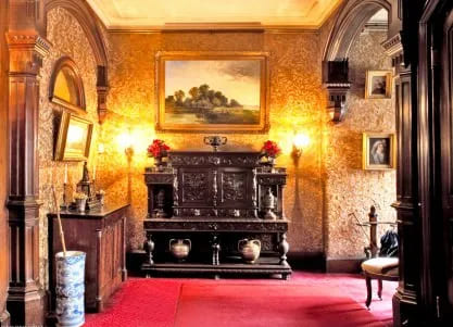
During my Residential Interiors program at the Boston Architectural College, we visited many historic houses in the Boston area. One was a 19th Century Victorian home on Beacon Street called The Gibson House. The walls of the first floor hallway in the Gibson House are covered in a dark “Japanese Leather” which has a gilded embossing. I remember loving it. The key is that the gilding of the paper reflected light which was very important in those days. I must have stored that hallway somewhere in my brain, because it was the inspiration for the wallpaper I chose – a cocoa colored vinyl textured wallpaper by Thibaut. Usually dark colors absorb light, but this particular paper by Thibaut has a sheen to it that reminds me of the Japanese Leather walls in the Gibson House. So although the wallpaper is dark, it changes colors as the light from the entrance doors and the chandeliers hits it. Here is the foyer of the Gibson House with the embossed Japanese leather wallpaper.
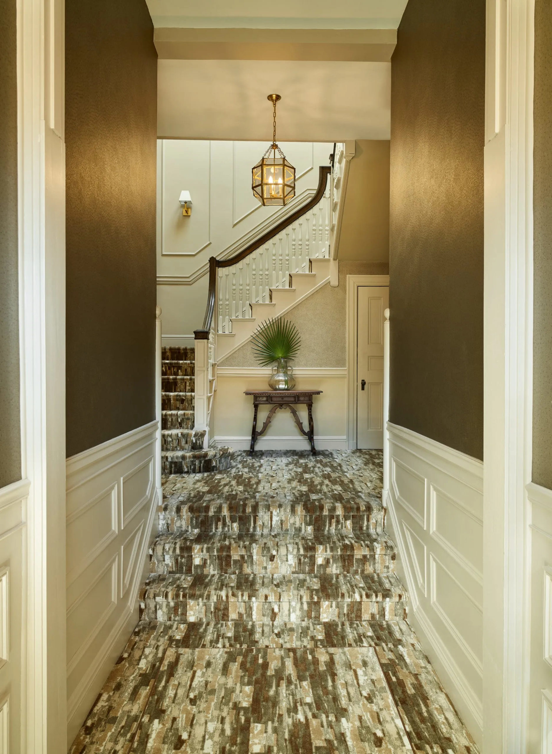
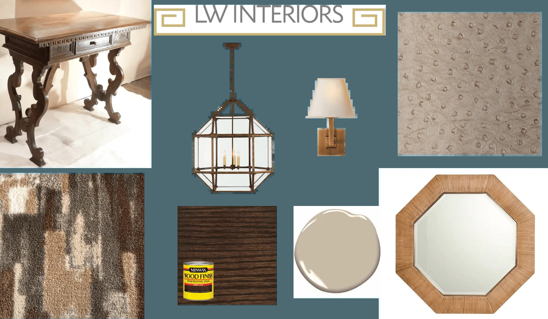
So I decided to treat the space as a residential entrance with a modern feeling. Since my favorite decorating is mixing styles, I chose a vibrant multi-colored rug with warm tones in a mid-century pattern, a textured wallpaper, and modern lighting with clean, hexagonal lines. I found a late 19th century Italianate Victorian console with plenty of curves and detail as a nod to the historic period. Here’s the mood board for the project which shows the color palette – a mix of warm neutrals, dark wood accents and antique brass lighting for a cozy, elegant feeling. Oh, and by the way, the rug needed to be a commercial grade – something super durable that hides dirt from the foot traffic.
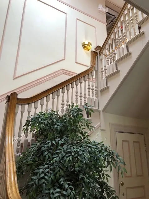
The bannister and railings are the focal point of the entrance, and my goal was to have them stand out. Goodbye artificial tree-you’ve had a good life! The before pics….

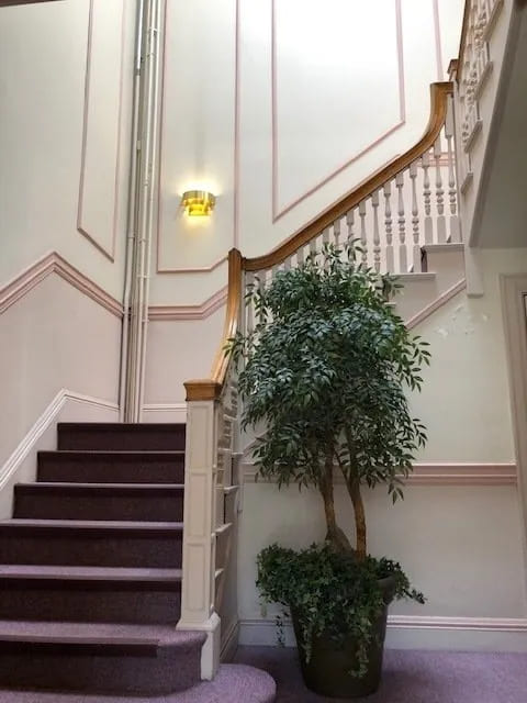
The pink and purple hues made me feel like I was in a Maalox commercial!
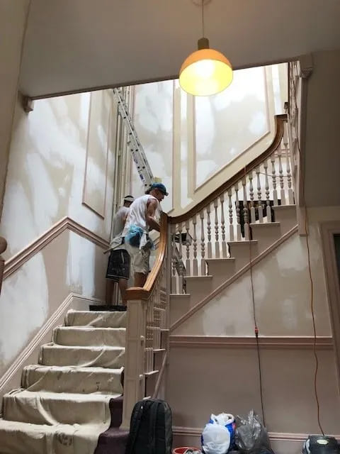
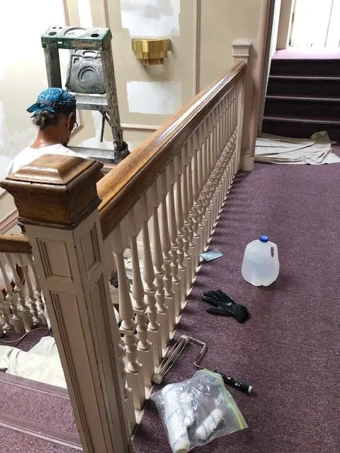
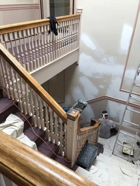
As the entrance was not touched for over 30 years, there was a tremendous amount of wall prep to do. The prep, priming, and painting of the walls and staining the bannister took over four weeks! The carpet was installed and then the wallpaper taking another two weeks. In the meantime, I gathered together the lighting and furnishings.
And finally, here are the “after” photos. We darkened the bannister in a Minwax ebony stain and painted the railings, trim and ceiling in White Dove. The walls and mouldings are painted in Ben Moore Brick House Tan (matte for walls, satin for mouldings). I love painting walls and mouldings in the same color, but different sheens.

Carpet by the Carpet Workroom; Sconces and Lanterns by Circa Lighting; Wallpaper by Thibaut; Benjamin Moore paint. The table and glass vase are from Autrefois Antiques. The faux tropical leaf which gives a cool contrast to all the warm tones is from CB2.
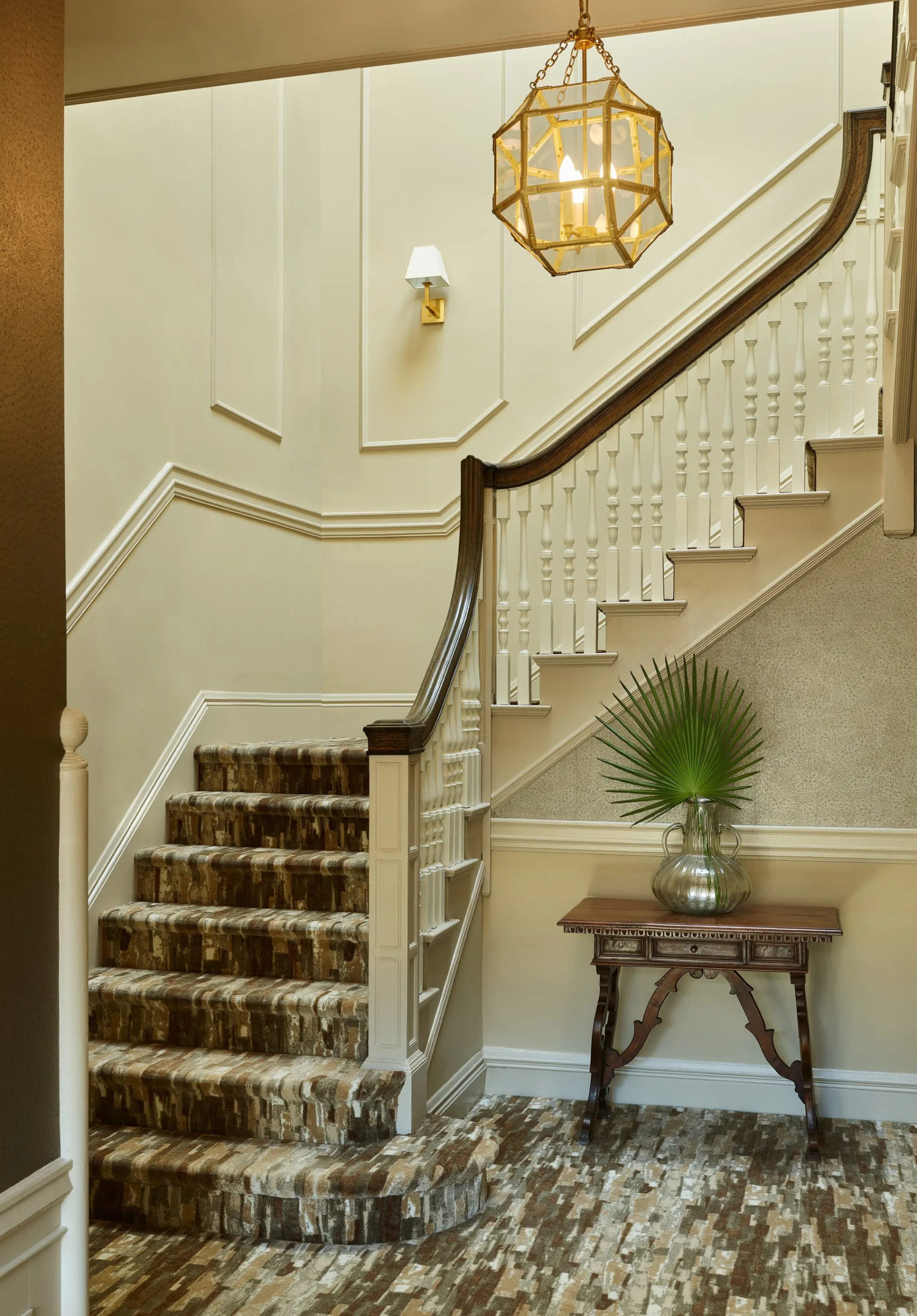
Here’s a close up of the bannister and wall details.
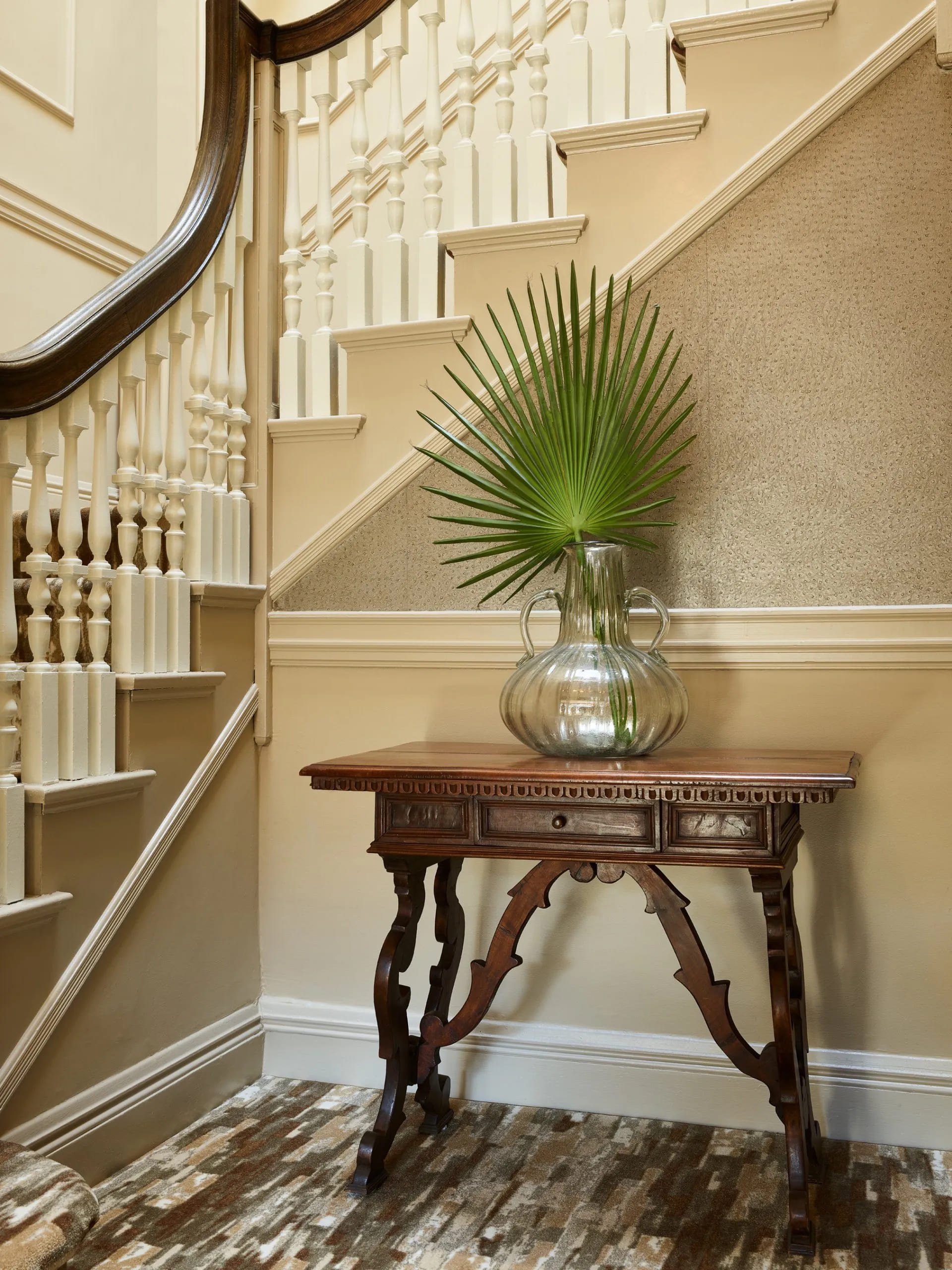
“After” photos by Jared Kuzia

Here I am happily working away in my office upstairs. Please feel free to contact me if you would like to work on a project in your own home. Right now I’m scheduling virtual consultations until we are free and clear from the corona virus. Hope to hear from you soon!
Photo by Jared Kuzia


