- August 5, 2020
- Linda Weisberg
Home Improvement While Social Distancing
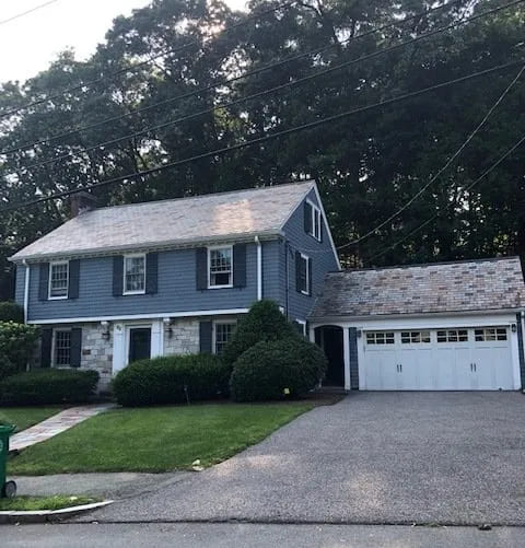
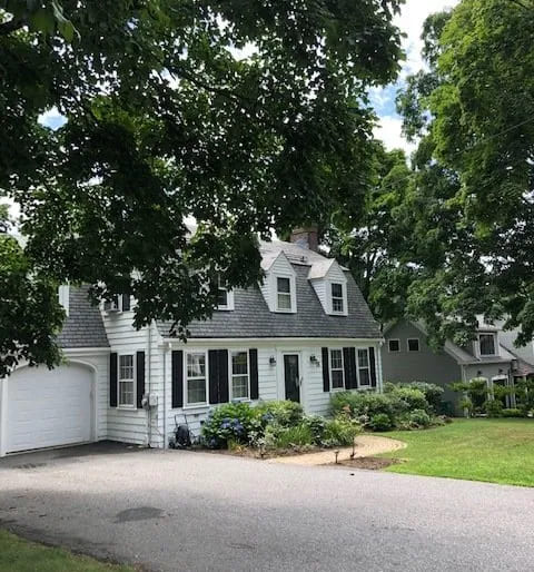
Many homeowners want to update and improve their homes given that we are spending so much time in them lately. Instead of taking vacations, many are choosing to catch up on home projects they have perhaps postponed. A good project to do this time of year is exterior painting. Here’s a “before” pic of a Newton Colonial where we recently provided an exterior paint consultation.
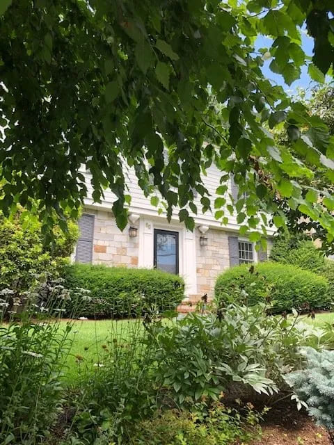
The Greater Boston area is filled with center entrance colonial homes like this one. It has a slate roof, a stone front on the first floor and interesting architectural details. It’s a lovely, spacious home, and the clients wanted to freshen it up with a new coat of exterior paint.
Choosing exterior paint can be daunting at times, and there are several basics to consider – the architectural style and design elements of the home, the color of the other houses in the neighborhood, the garden plantings and of course, the clients’ favorite colors.
First, the architecture of the home is important because there are many elements to consider such as architectural trims, moldings, and light fixtures. Also the materials of the exterior are important – the brick, siding, stone or brick and roof shingles. And of course the front door and garage door. The roof and walkway are also important elements in selecting paint colors.
Second the colors of homes nearby are important. Most people want their homes to blend in the neighborhood.
Third, the homeowner might have flowers in the garden that inspire an interesting accent color for the door or have a favorite color they would like to include in the scheme.
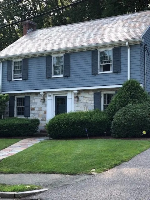
Here’s the house across the street. It has a mid-range neutral color with white trim that goes well with the dark gray roof which is a strong element. Very classic.
Here’s another house across the street- a Cape style home with a white body, black shutters and a gray slate roof. Charming.
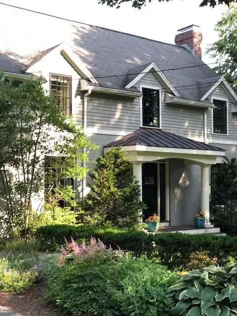
The client’s house was a little tricky because of the variegated colors of the slate roof and the multicolored stone façade on the first floor. In addition she wanted to incorporate a dark blue gray color that she had seen at another house in the neighborhood into the scheme. I thought that the dark gray on the siding on the second floor with black shutters made the house feel a little top heavy. Between the white gutters and the black trim, it made the house look smaller than it actually is. What color would pull it all together? We decided to use a light blue gray, Ben Moore Stonington Gray, for the second floor, and a dark blue gray the client loved called Almost Black for the shutters and front door. The light blue gray color unites the color in the stone front on the first floor and the light blue slates on the roof. Notice how the gutters don’t stand out as much against the lighter color. We also used a warmer white for the architectural molding and trim around the front door, the gutters and the garage door to make sure they would blend with the warm gold tones in the stone façade.
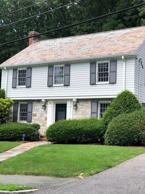
This gave the house a lighter, brighter feeling. In fact the neighbor from across the street came over right away to say how much larger the house looked! Happy neighbors = happy neighborhood!
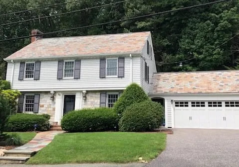
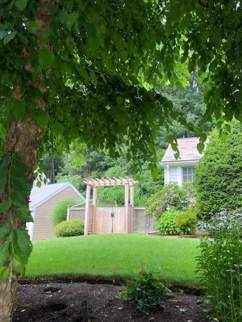
We also added a lovely arbor fence gate that leads to the garden in the back yard.
For final touches, we replaced the storm door and refreshed the front door lights with a black enamel paint.
Feel free to call us for an exterior paint consultation. We would be happy to assist you!
![]()