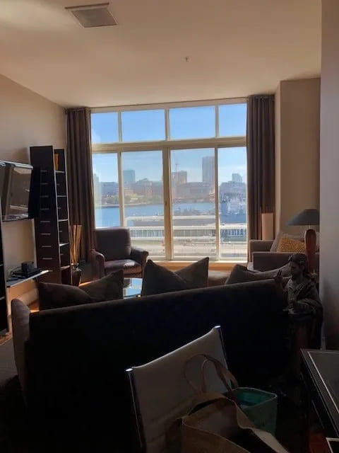
When I first saw the waterfront view of this condo in Charlestown, MA, I knew this would be a fun project. The clients who live full time on Cape Cod, bought this pied-a-terre as a place to stay while in Boston. In the “before” picture below, the furnishings from the previous owner were very dark and masculine. A large sofa placed in the middle of the room cut the space in two, making it feel small and cramped. The dark brown draperies that framed a gorgeous view also lent a dark and gloomy feeling in the room.
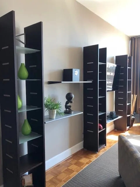
Here is another “before” shot in the living room. Instead of a wall of dark black shelving, we purchased a console from Crate and Barrel for under the television on the left side of the room. It blends better with the design of the new sitting area which you can see below.
The goal was to lighten the space and give it a nautical vibe with a mix of finishes. The clients had already chosen a light colored luxury vinyl tile plank floor. Once that was installed, we painted the walls and moldings Benjamin Moore White Dove to create a light, bright feeling. The wife’s favorite color is blue which felt right for a place on the water. So after the floor plan was approved, we began to select furnishings and fabrics with that in mind.
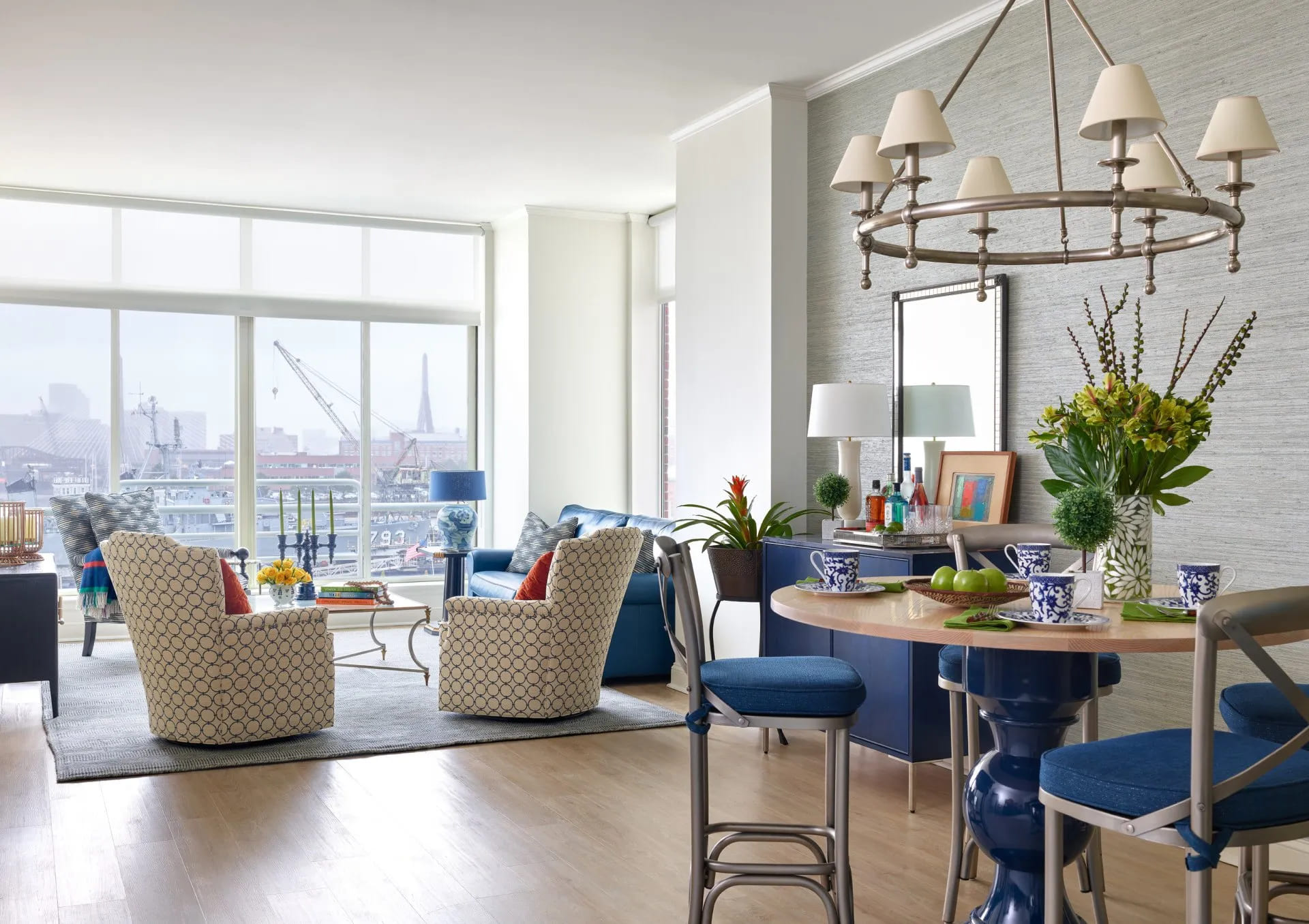
We opened up the space by placing the blue leather sofabed in the nook. We were then able to add two swivel chairs and an accent chair – in Kravet and Ralph Lauren fabrics respectively. With the seating area arranged this way, we then had ample room for the bar cabinet, TV console and dining area. Since the client wanted to have full access to the view with protection from the sun, we installed solar shades by The Shade Store.
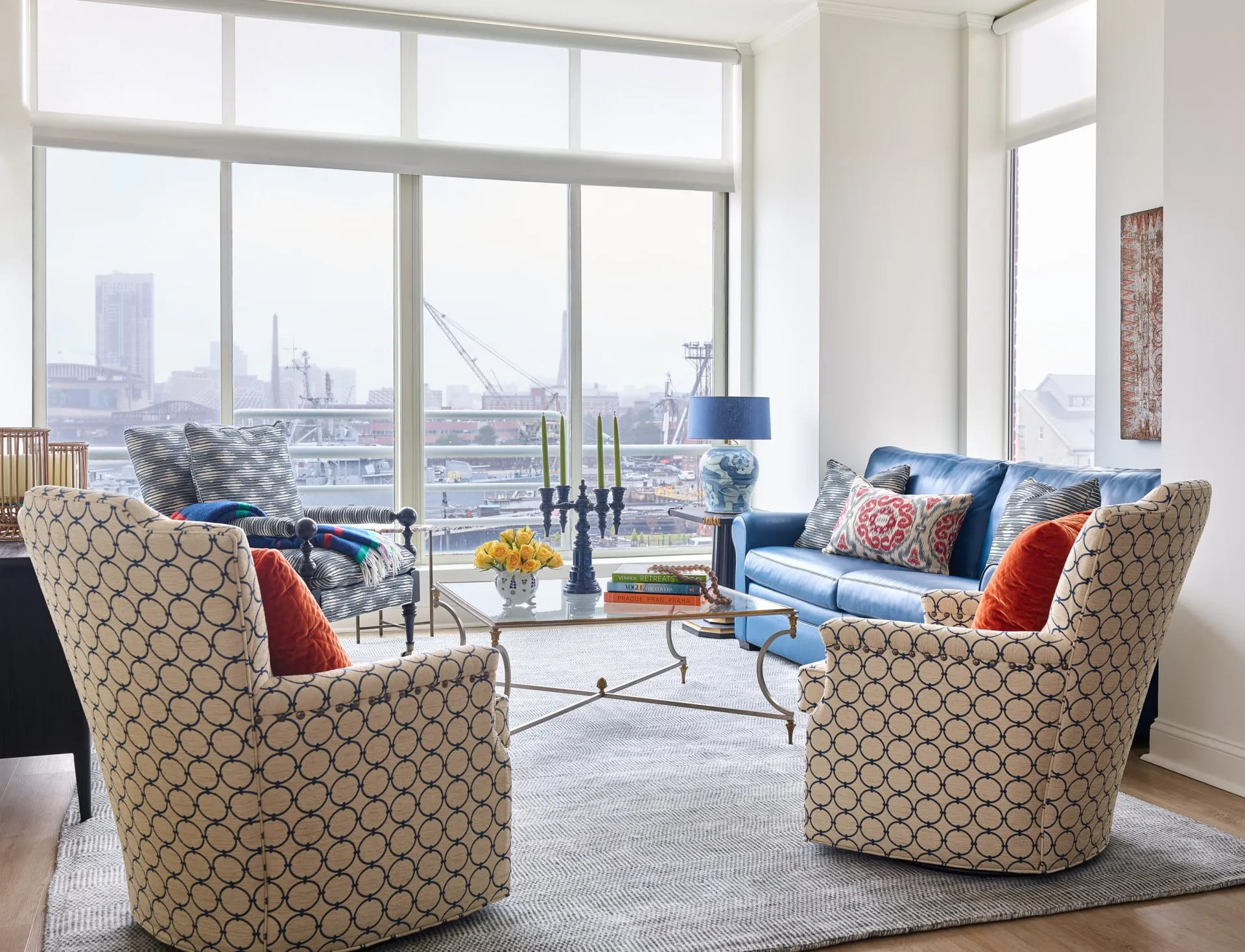
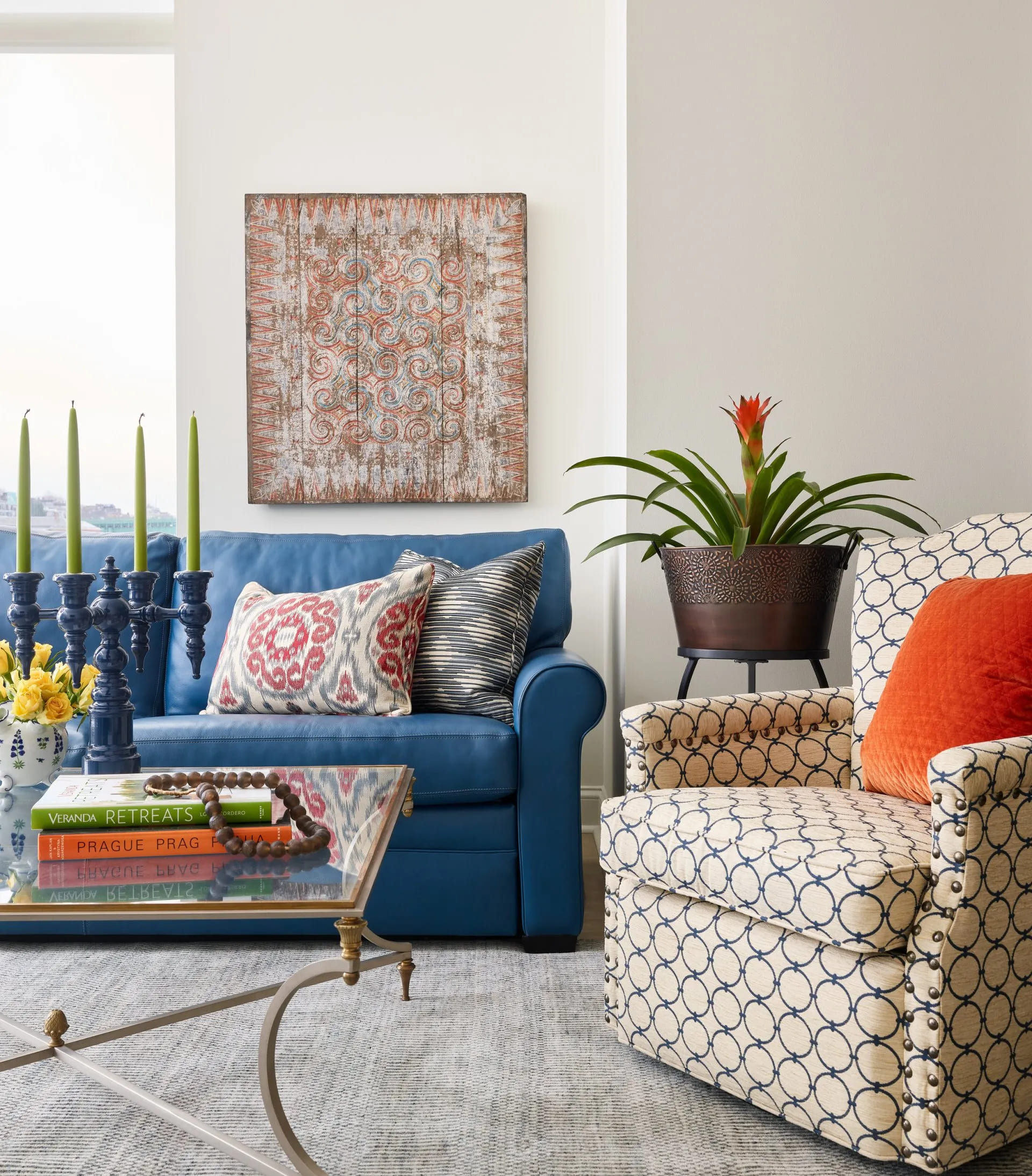
Here is a closer shot of the sitting area. The comfortable sofa bed by Lee provides a second sleeping option in the one bedroom apartment. The mid-century coffee table was purchased from a dealer in Los Angeles.

I love the blue leather on the sofa, the mid-century coffee table and the mix of patterns and textures.
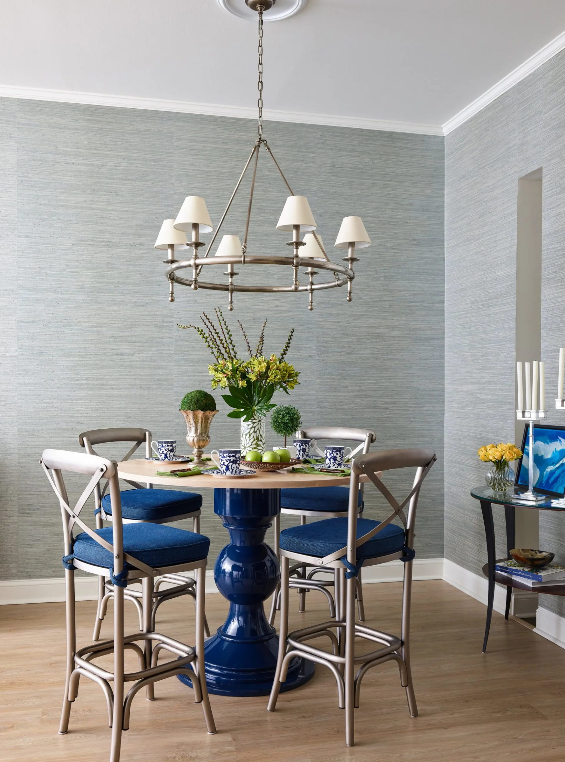
To give more definition to the dining area, we covered the walls in a watery blue Thibaut grass cloth that feels just right in this setting. The counter height table is by Dunes and Duchess. The counter stools by Ballard Designs have custom seat cushions in a performance fabric by Kravet. The chandelier is from Circa Lighting.
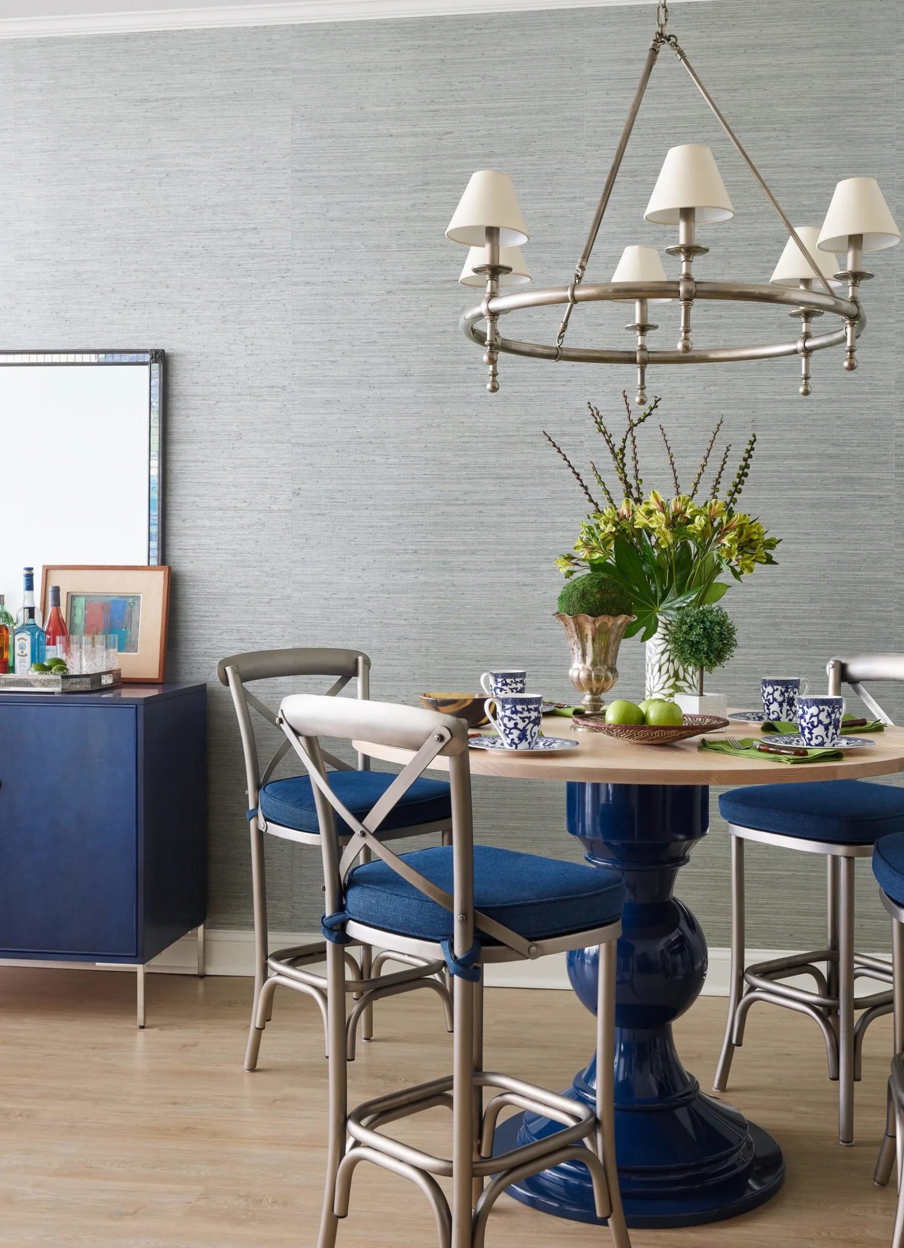
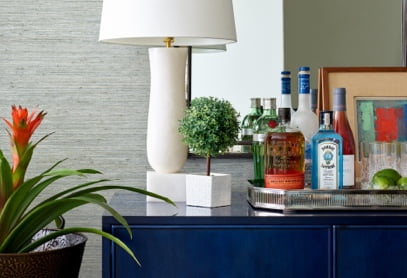
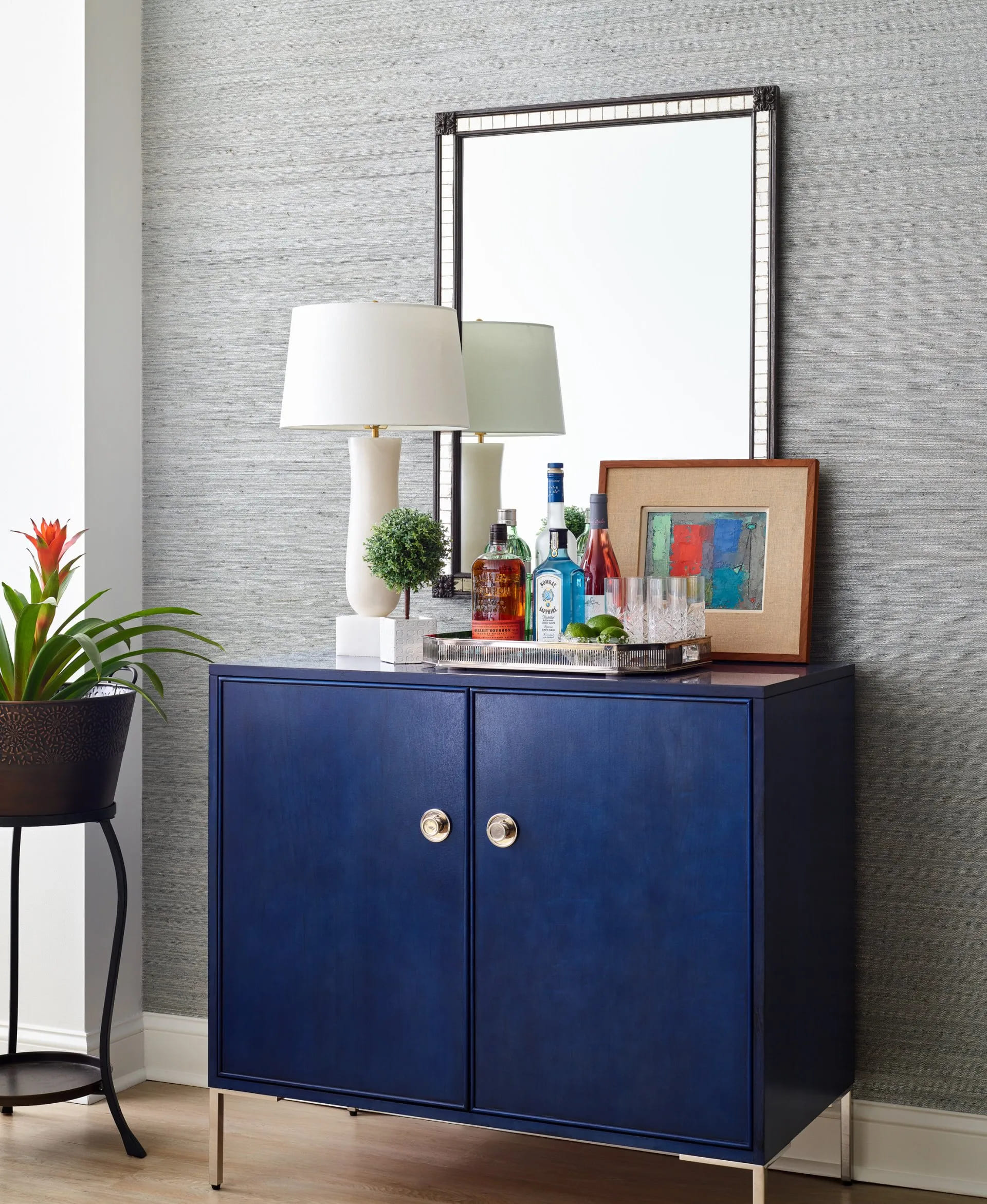
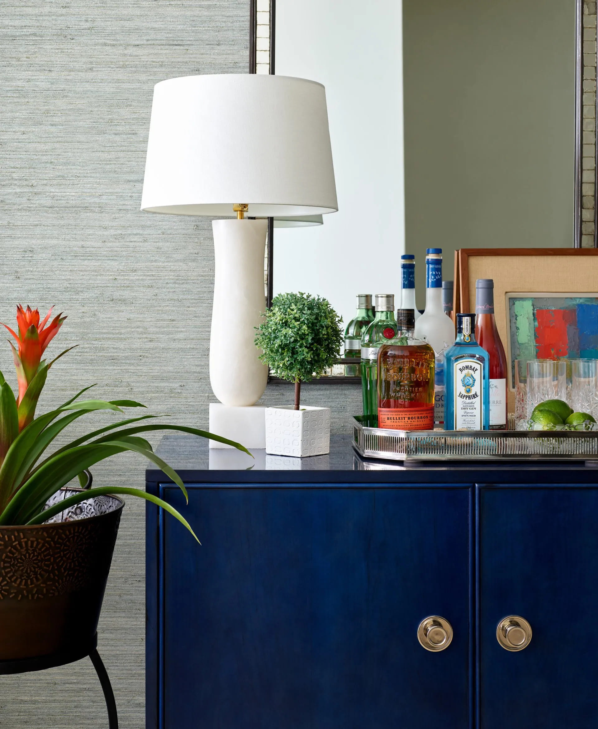
The bar cabinet by Century Furniture was a must for the clients who love to entertain. We paired it with an antique mirror from Autrefois Antiques and lamp from Studio 534. The antique silver galley tray is from Berkshire Home and Antiques.
Here’s a close up of the bar details.
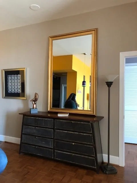
The clients purchased the wood and metal cabinet from the previous owner. The large mirror placed on top was disproportionate. So we placed it against a wall in another spot in the apartment.
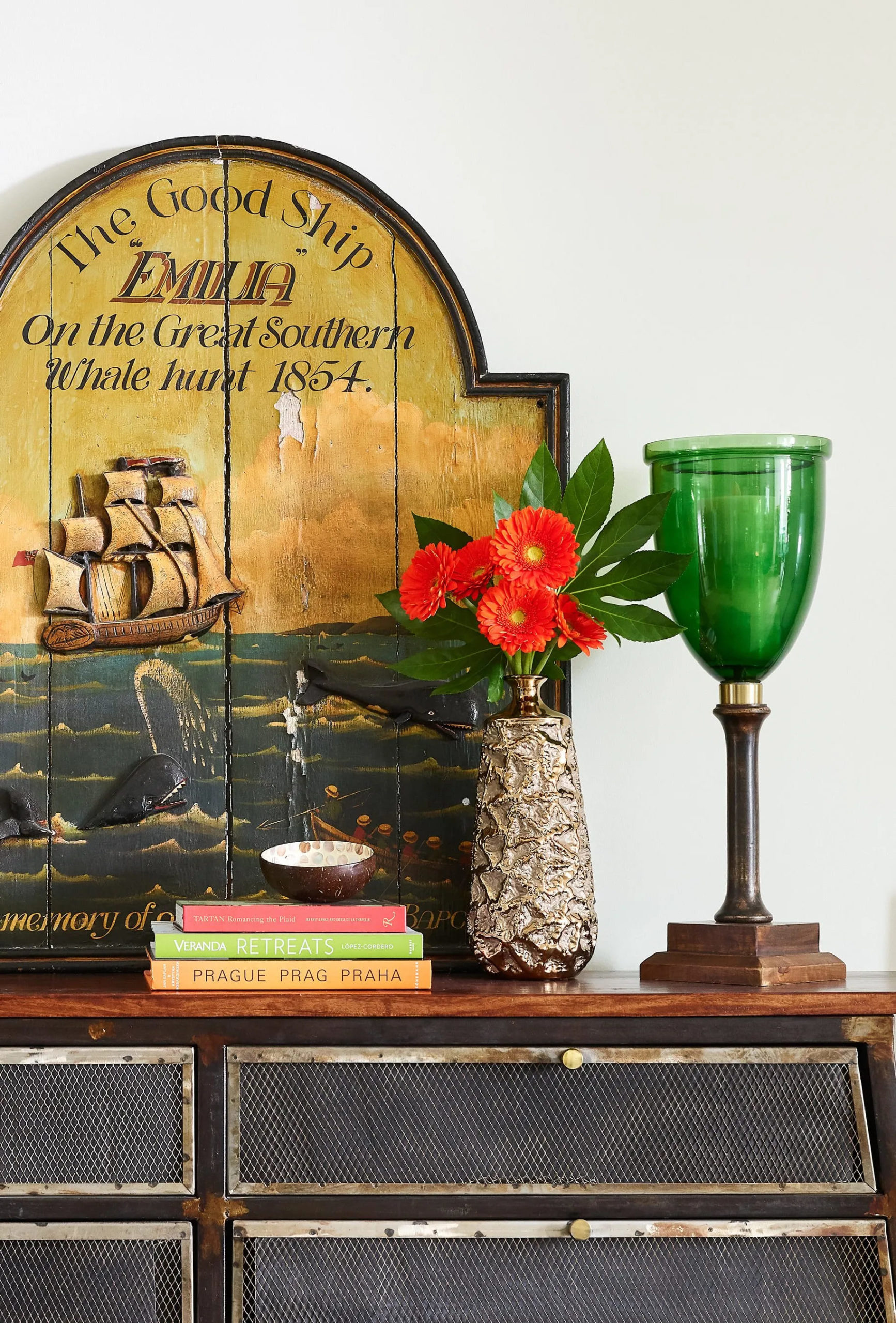
Instead of the mirror, we added an antique plaque of a whaling scene from Boston Design Center’s Market Stalls with hurricanes, books and flowers. The beautiful handmade Indian rug is from Landry and Arcari. We flanked the cabinet with 2 stools for extra seating at the counter height custom made dining table from Dunes and Duchess.
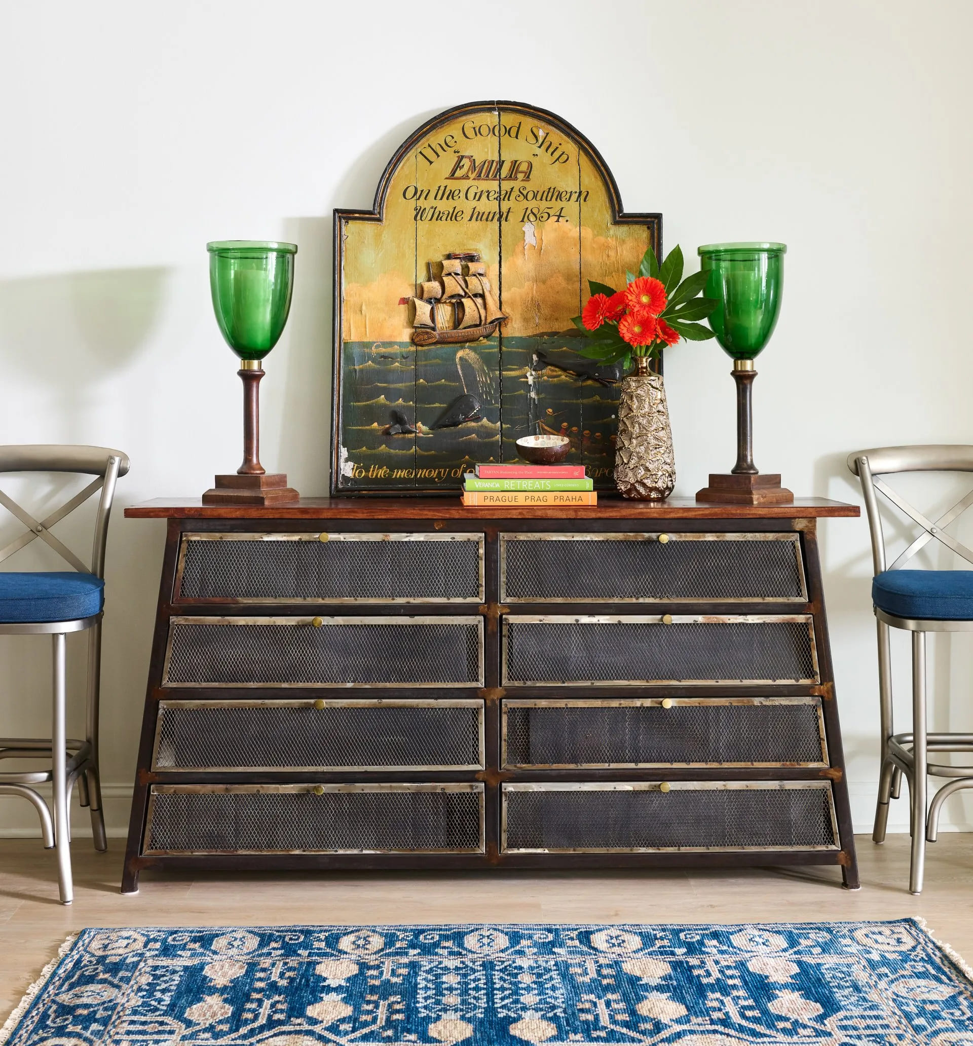
Here’s a closeup of the details – a nice mix of color and texture. The green hurricanes are from Oomph in Greenwich, CT.
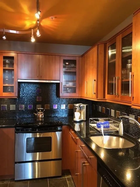
The kitchen was dark. The clients wanted to keep the Brookhaven cabinets which were in good condition.
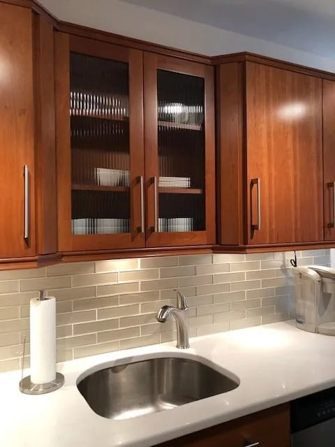
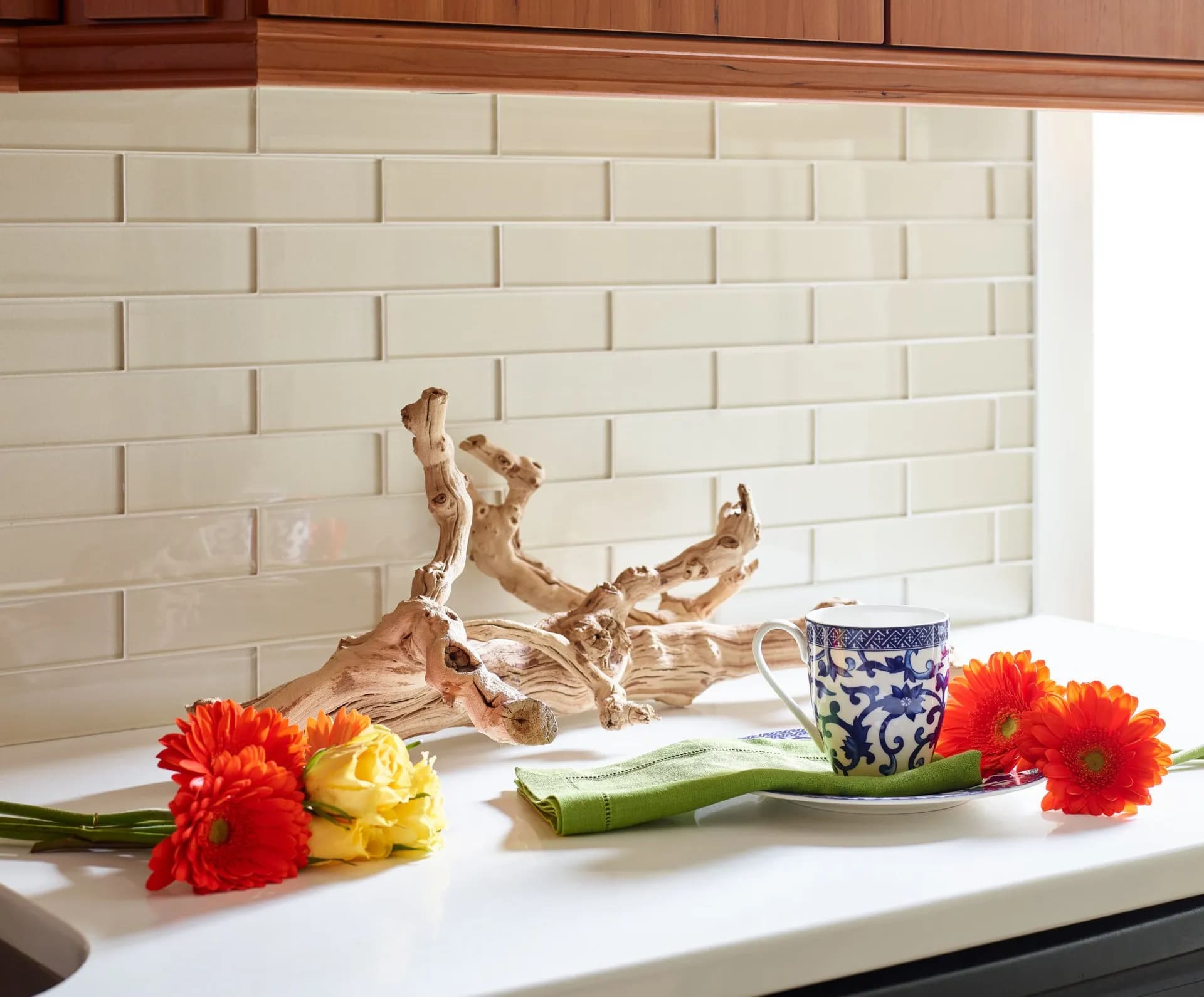
To brighten it up, we changed out the counter and backsplash and painted the walls and ceiling the same color as the rest of the unit-Benjamin Moore White Dove. The glass tiles and white quartz counter create a lighter feeling.
Interested in doing a makeover in your home? Don’t hesitate to call LW Interiors for a design consultation. We’re happy to help!
Photography by Jared Kuzia


