- June 25, 2021
- Linda Weisberg
If you are in the market to buy a work of art, you may ask yourself, should the art match the colors in the room?
Actually, yes and no. Art can match some of the colors, or it can be the direct opposite, creating contrast. It can be black and white. Not only should color, but size and scale, and mixing old and new be considered. Did you inherit something special? Is there something you bought on a vacation that brings back special memories? Do you want to start an art collection? If so, how do you incorporate art in a design scheme? What is the best way to make it work?
Sometimes during process of designing a room, choosing art is left until the end of the project. That is the time when the clients might have decorating fatigue or the budget is close to running out. So it’s important to decide early on if art will drive the design process and be an integral part of the budget. It is the time to decide if the art is to be the focal point or if it will blend in as part of the décor.
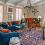
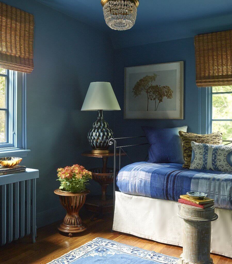
But if your home is already furnished or if you decide you want to see how your room looks once all of the furnishings and draperies are installed, harmonizing the art to the room is a perfectly fine way to decorate a room. In the deeply saturated blue room below, we added a neutral hydrangea print on canvas to balance the color once everything else was installed.
Or if you prefer art to be the “wow” factor in a room – that the art is the first thing you see? Do you want art to be the focal point of the space?
A colleague of mine, Boston area art consultant Jacqui Becker, has another perspective. She suggests that we first ask ourselves “What does art do for us?” and to consider how you want to FEEL in a space. Do you want to feel pleasure every time you look at it? Do you want visual stimulation? Do you want a serene feeling? In any case, studies show that art we love can produce endorphins that elevate our mood. It is better, from Becker’s point of view, to decide early on in the design process what role art is going to play. As designing a room is about how you want to live in a space and how you want to feel when you’re in it, it makes total sense to incorporate art earlier in the design process. In her view, blending art with colors in the room comes after.
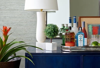
Here are a few examples how we used art in some of our recent projects.
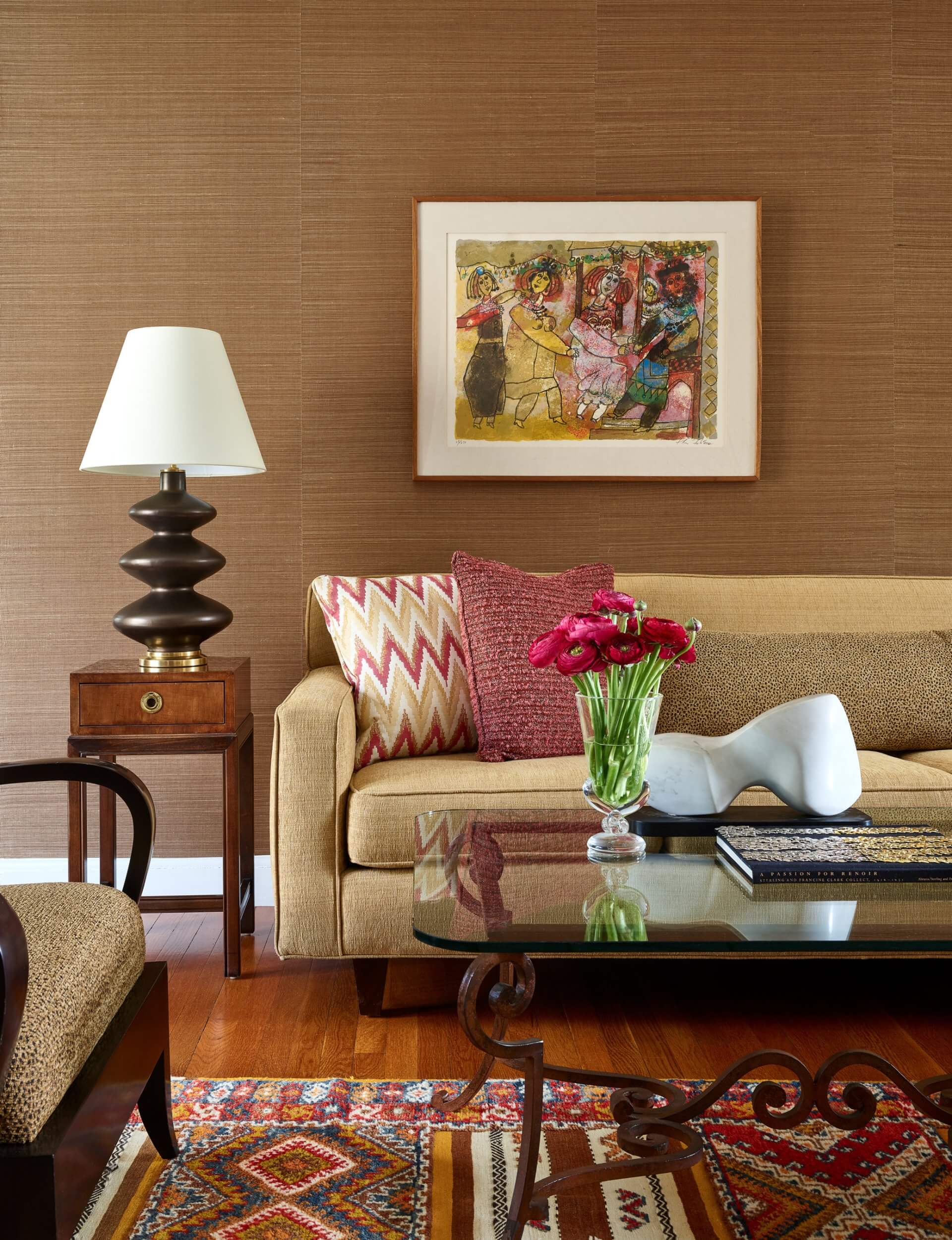
The clients found a print by an Israeli artist early in the process of their living room update. The wife who was born in Israel was immediately attracted to it. We added vibrant pillows in pink and gold tones to relate to the global feel of the art and rug. Finding something toward which the clients had an emotional connection earlier in the project, made the room come together better than had we found something afterward.
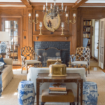
The Indonesian wood sculpture above the couch blends well with the global feeling of the textile patterns. It was added later in the project.
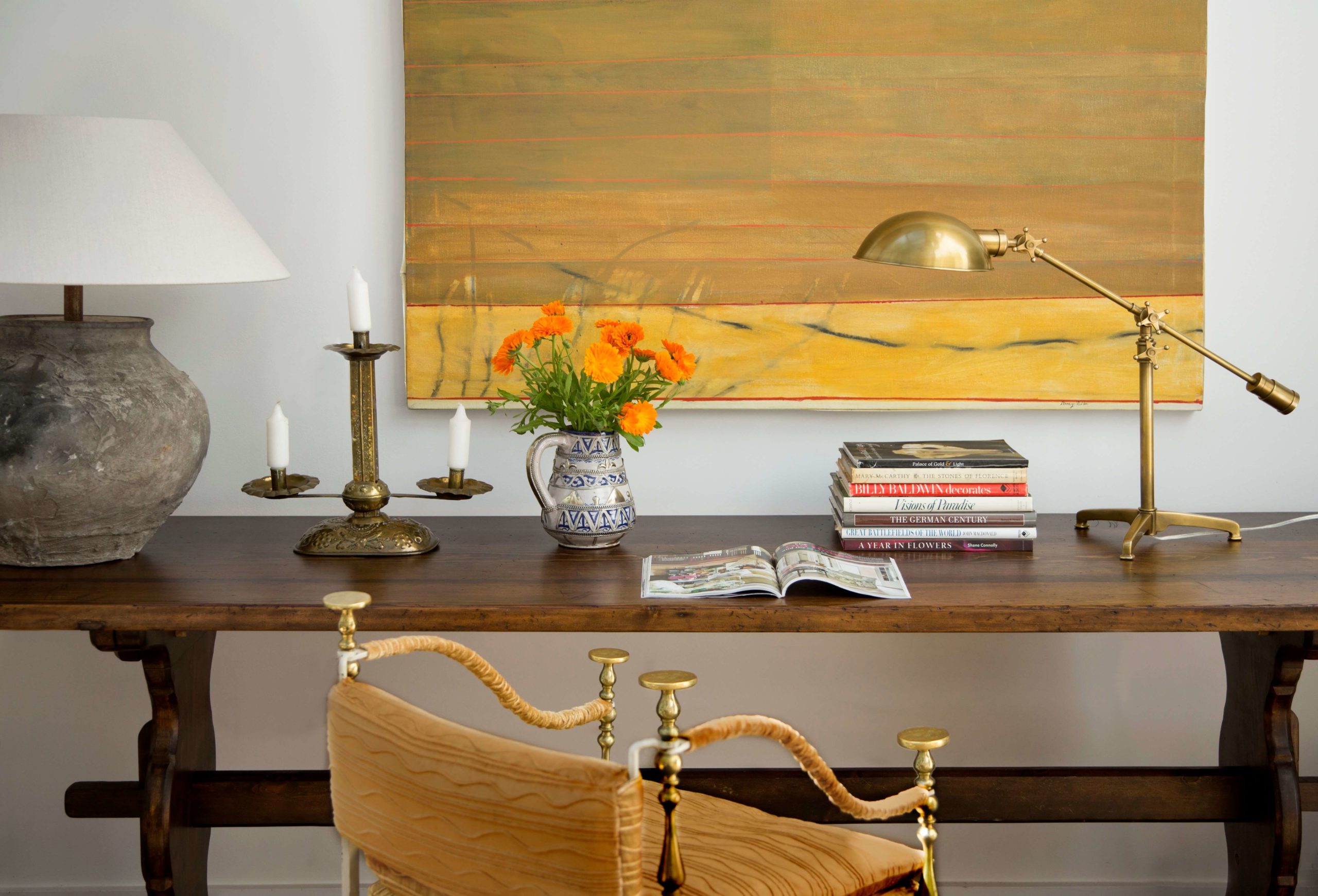
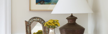
This painting which already belonged to the clients brings life to a neutral room. A yellow velvet chair fabric was brought in later to pull in the deep yellow tones from the painting. Pulling out a color from a work of art is great for design accents. But the painting which belonged to a favorite relative came first in deciding the color scheme in the room. (Eric Roth photo)
A friend was at the office and saw the print above that I was using in another project. She fell in love with it and had to have it in her dining room!
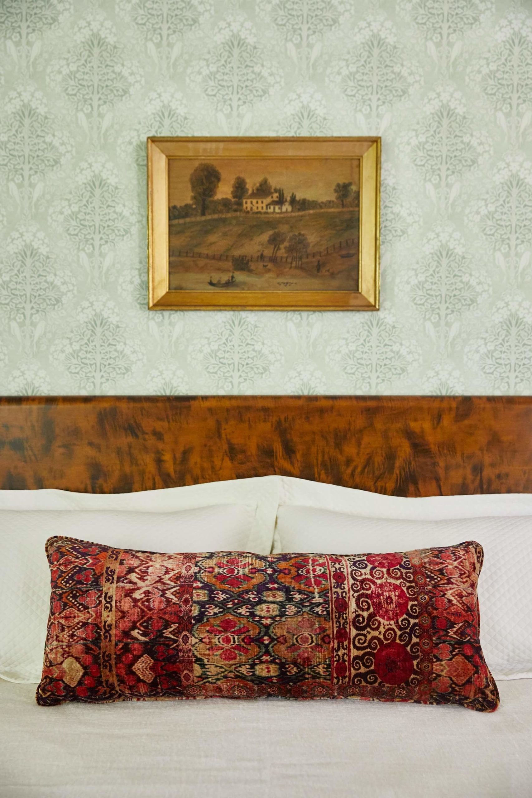
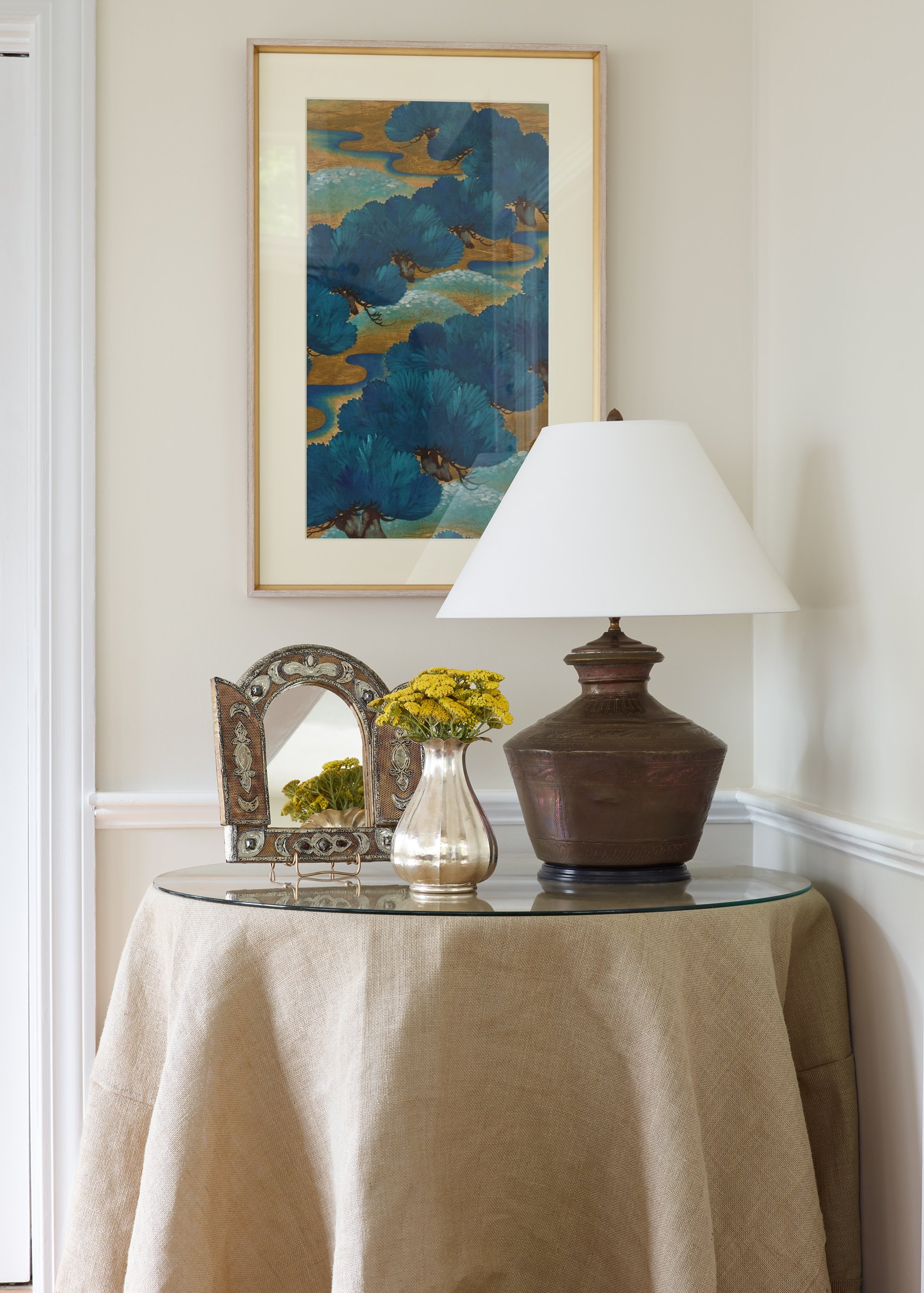
This 19th century oil painting in a 1790 farmhouse master bedroom in Metrowest Boston reminded me of the property on which the house sits. Found during the project planning, the clients agreed to incorporate it into their master bedroom design. In this vignette, everything blends together.
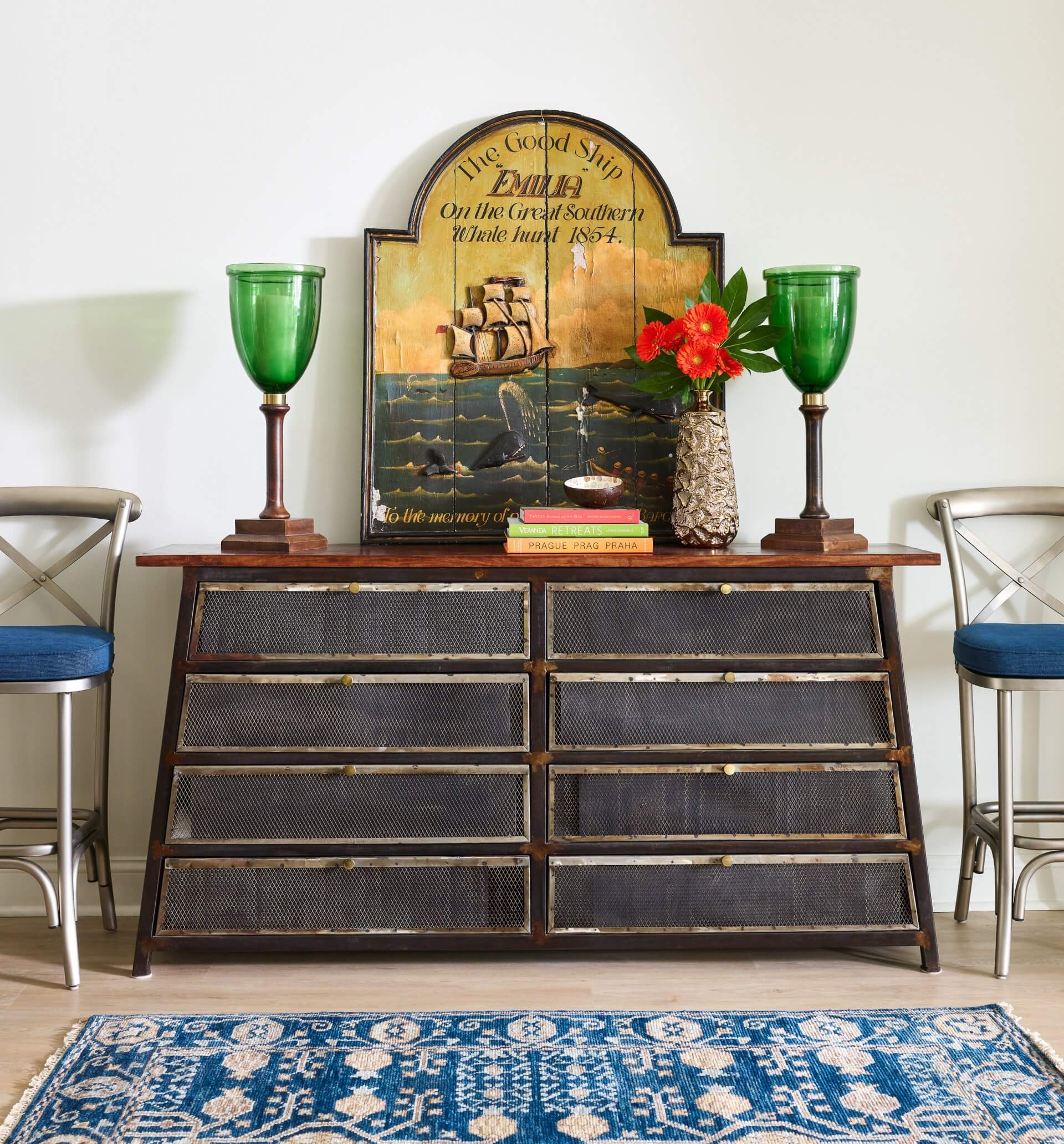
We really pushed the exuberance factor with this 19thc wood plaque of a whaling scene for a Charlestown waterfront condo. We found it in the early in the design process.
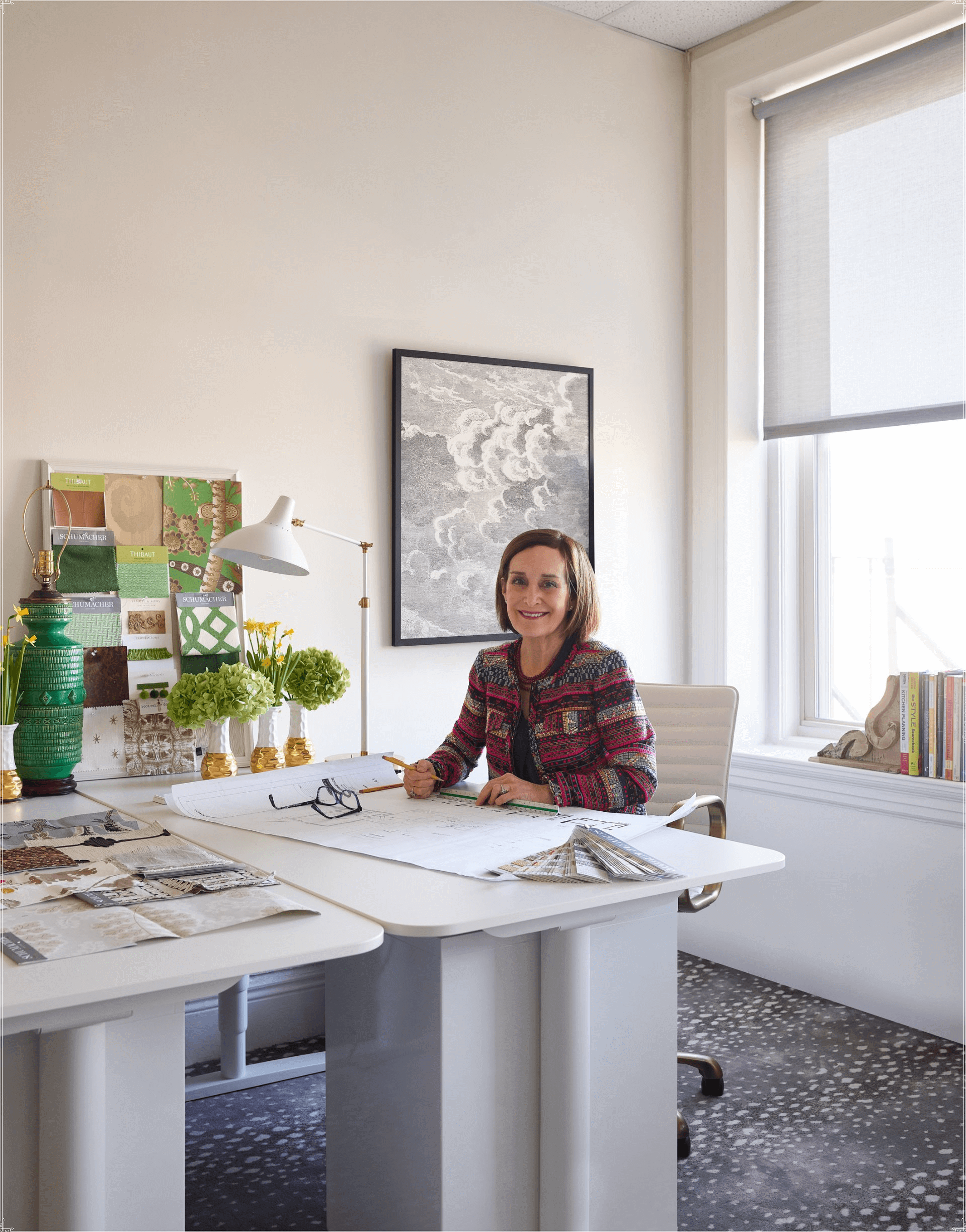
Want to incorporate art into your decor? We’re here to help. By the way, behind me is a favorite wallpaper fragment that we framed. Working with color all day we wanted to maintain a neutral palette in our work environment.
All photos by Jared Kuzia unless otherwise indicated.
![]()