LW Interiors Project Angel Wings – Master Bedroom Reveal!
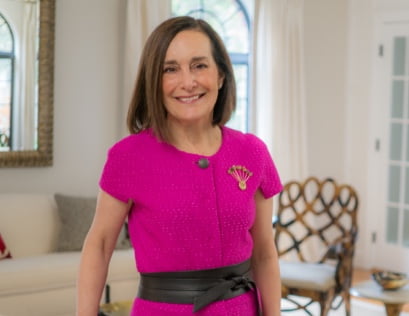
Welcome to the final week of the Fall 2017 One Room Challenge! The ONE ROOM CHALLENGE sponsored by Linda of Calling it Home and media partner, House Beautiful, is a bi-annual online design event held every April and October. Twenty design bloggers from around the country take the challenge to design a space in six weeks and blog about the design process to their readers on Wednesdays. Anyone else with a blog is invited as a guest participant linking their room transformations with the event on Thursdays. There are about 200 guest designers from around the country and plenty of inspiration to be had! I am Linda Weisberg of LW Interiors, and this is my first time as a guest participant in the One Room Challenge. I’m here to share the final reveal of “LW Interiors Project Angel Wings” – my master bedroom update.
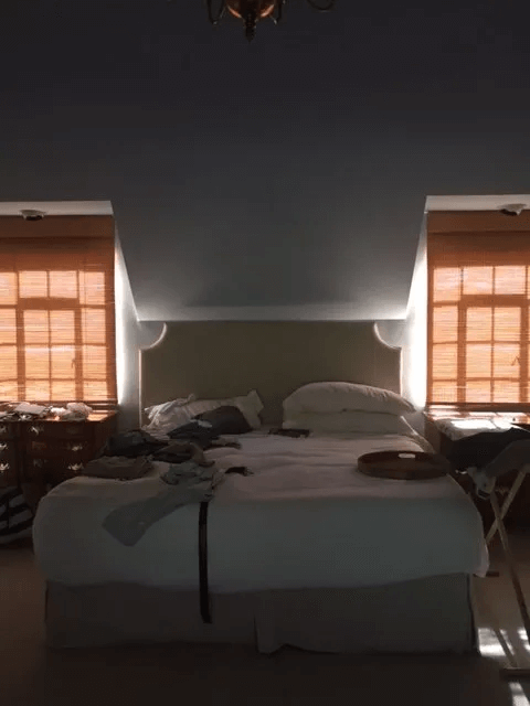
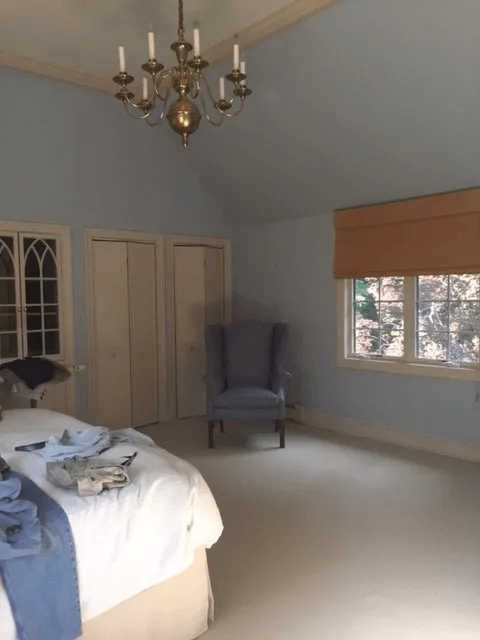
Do you remember this “before” shot of the room?
Here’s how it looks now!
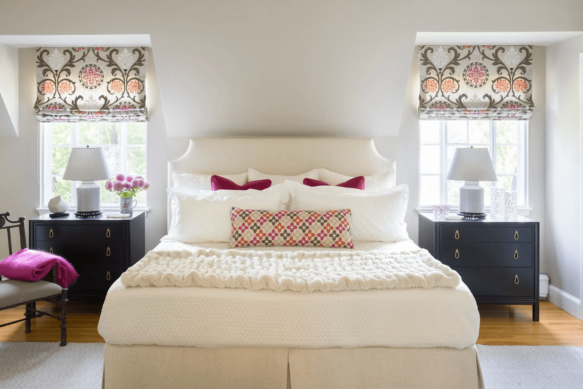
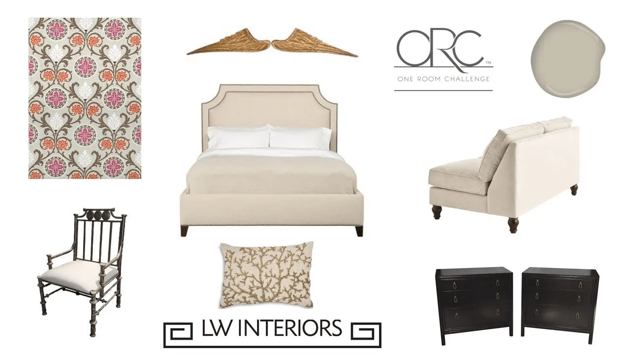
I thought to achieve a tranquil feeling in this master bedroom would be to layer it with neutral textures. But I also wanted some visual excitement, so I added the hot pink pillows and throw. The black mid-century modern chests counter the hot pink hue to keep it from going too girly and consequently creates a balance from a male-female perspective. The bedside chests, iron chair, and lamp bases are from Berkshire Home and Antiques. Roman shade and lumbar pillow fabrics are by Thibaut. Solid velvet pillow fabric is by Duralee. The cozy pink mohair throw is from MacKimmee Co. Existing headboard by Partners in Design. Bedding by West Elm and Ralph Lauren. Fur throw from Bloomingdale’s. Rug by Dash and Albert. (Photo by Eric Roth Photography)
Another “before” pic of the sitting area.
And after…….
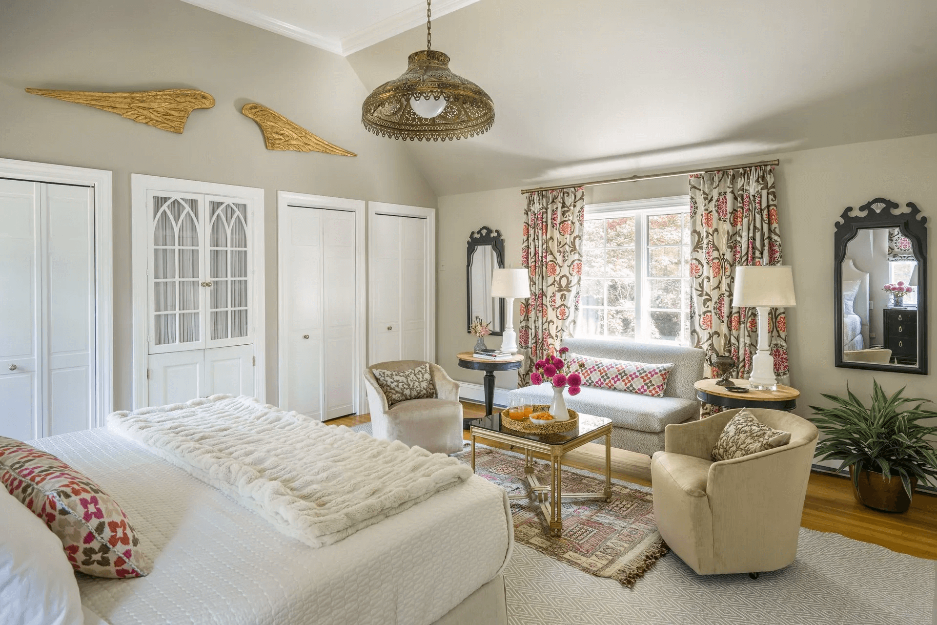
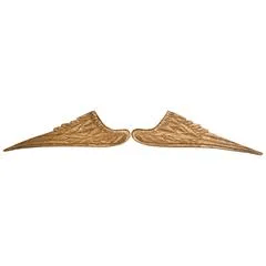
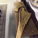
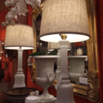
Across from the bed is the sitting area. The vintage love seat is covered in a Thibaut fabric. The swivel chairs I already owned are in a Duralee velvet. Vintage tables and mirrors are from Berkshire Home and Antiques. Lamps are from Peridot Antiques. I love how the Mideastern vintage pierced lantern goes so well with the Moroccan rug and the drapery fabric. And of course there are the antique angel wings which I love! Both lantern and angel wings are from Berkshire Home and Antiques. The beaded pillows on the swivel chairs offer more texture and are made by Michael Aram. (Photo by Eric Roth Photography)
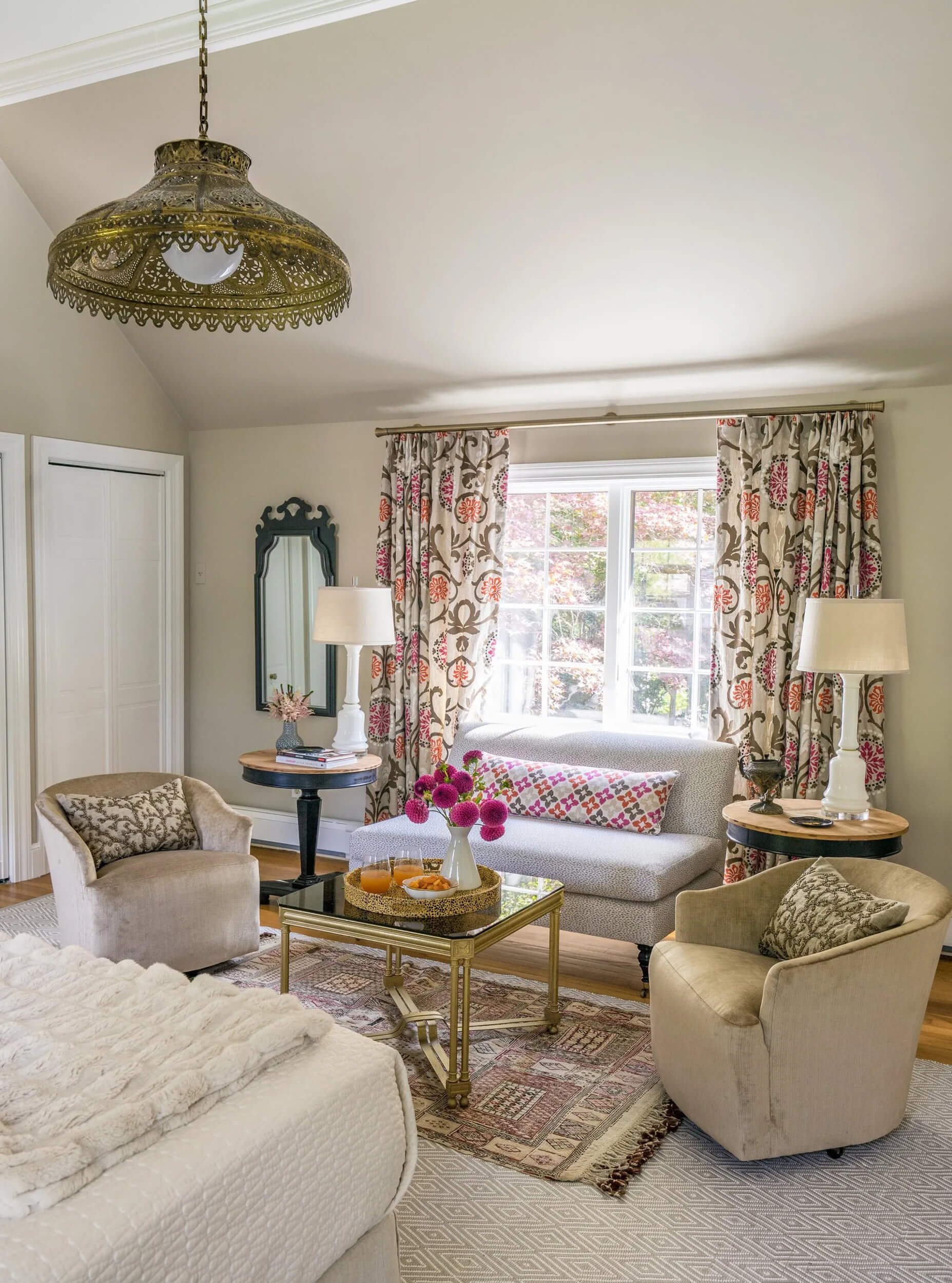
Here’s a closer view of the sitting area. You can see more details in the textures, patterns and accessories. I’ve already had my morning coffee up here. It’s so comfy and cozy! Also the love seat has a Crypton fabric, so I’m all set in case I have a small spill! (Photo by Eric Roth Photography)
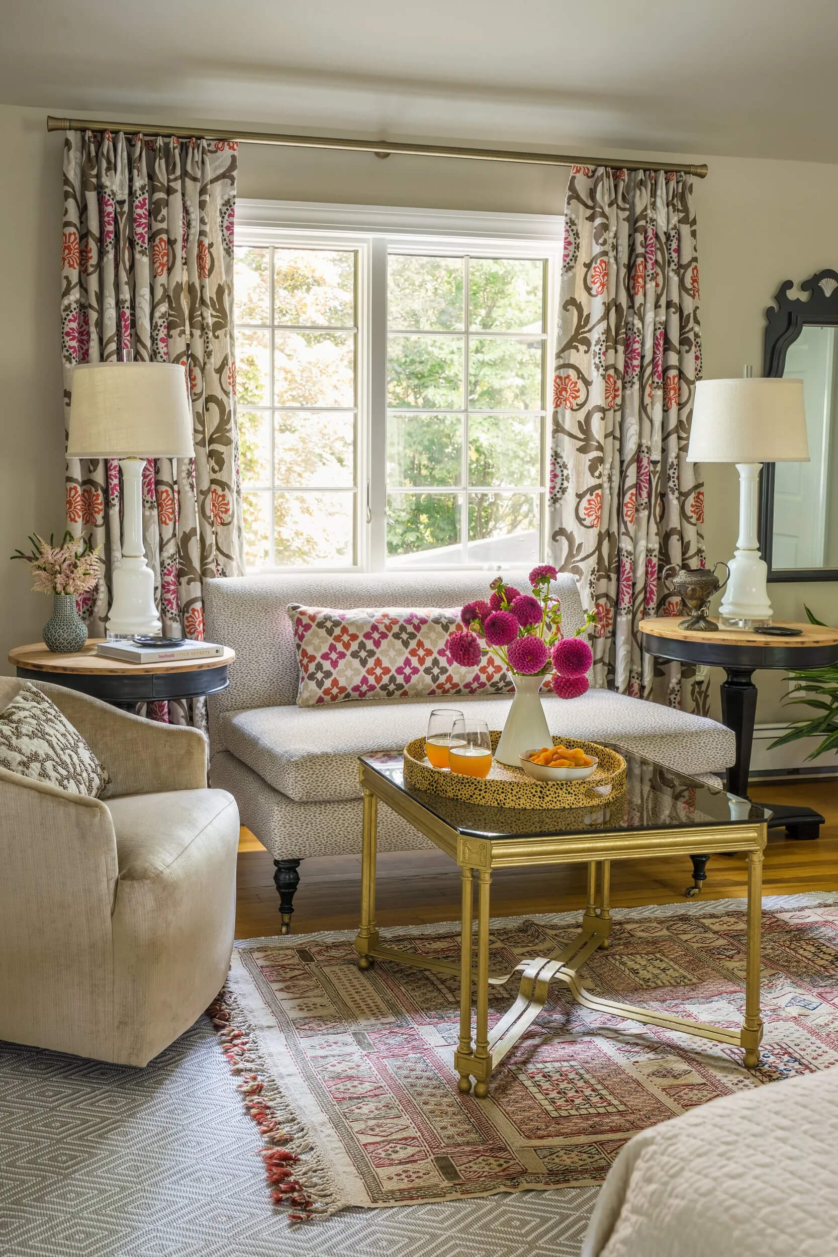
A closer close up. (Photo by Eric Roth Photography)
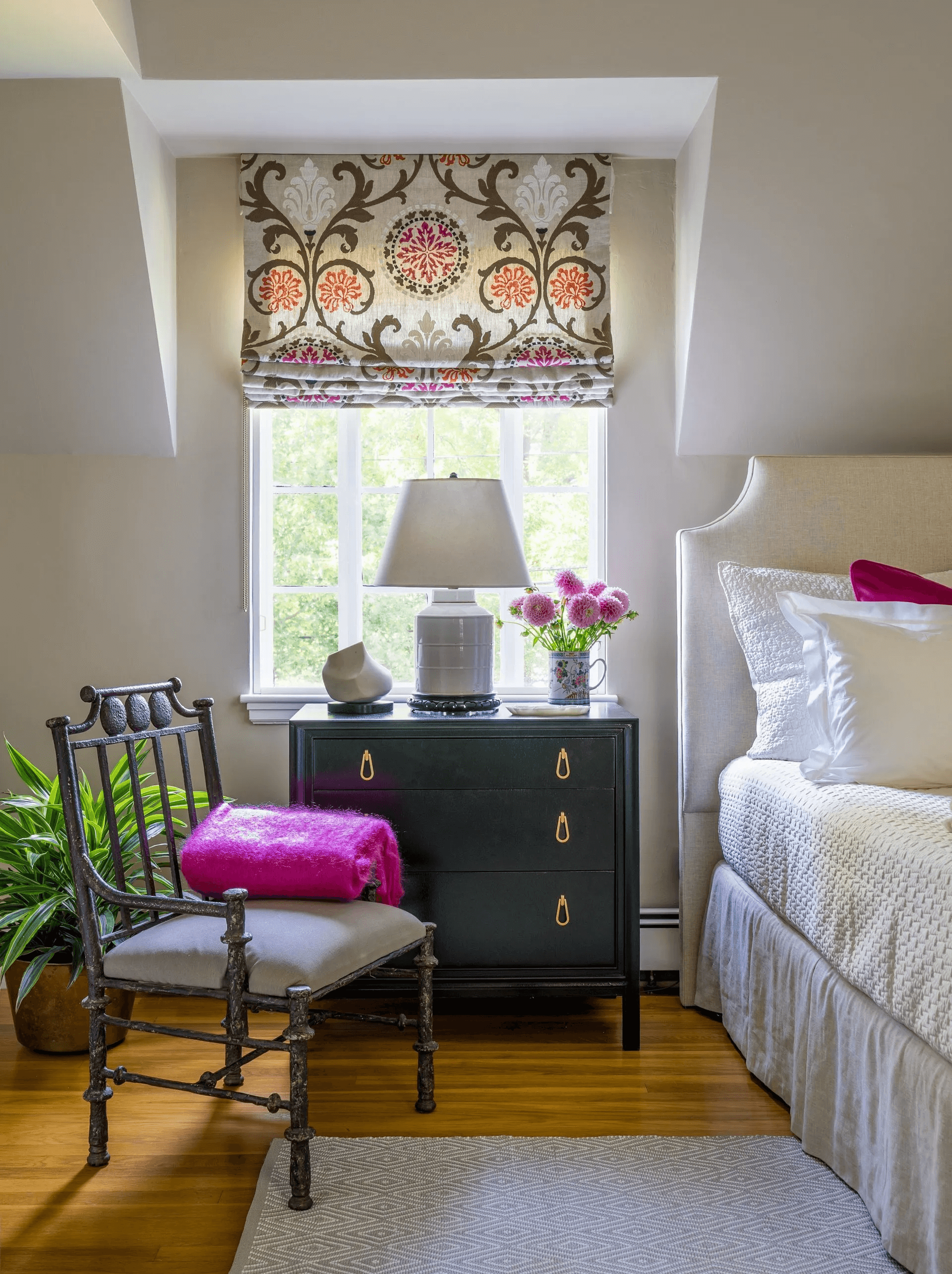
Here is a close up near the bed. I really like how the shape of the chair and headboard resemble one another and blend with the window fabric motif. Finally everything is finished, and now it’s time to enjoy it. Let me know what you think! (Photo by Eric Roth Photography)
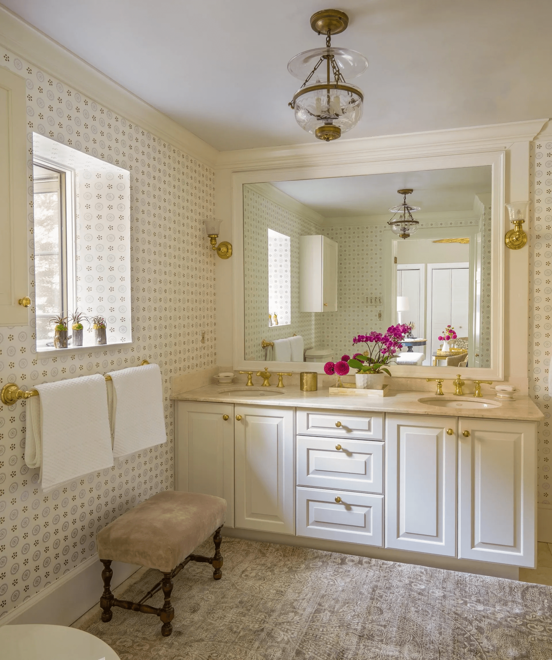
Here’s a bonus pic – I decided to style the master bath for the photo shoot. The colors of the bathroom and master go together beautifully now. I renovated the bathroom quite a while ago, but updated the wallpaper from Cole & Sons within the past few years. I added a beautiful rug from Landry and Arcari. The lighting is vintage. The bench is a yard sale find. If space is available, I love to place a piece of furniture in a bathroom. (Photo by Eric Roth Photography)

Thank you again to Linda of Calling it Home and media partner, House Beautiful for sponsoring this event. It’s been a great experience to connect with everyone. Link up here to see the final reveals of the One Room Challenge Designers and guest designers.
