A Living Room and Adjacent Dining Area – Before and After
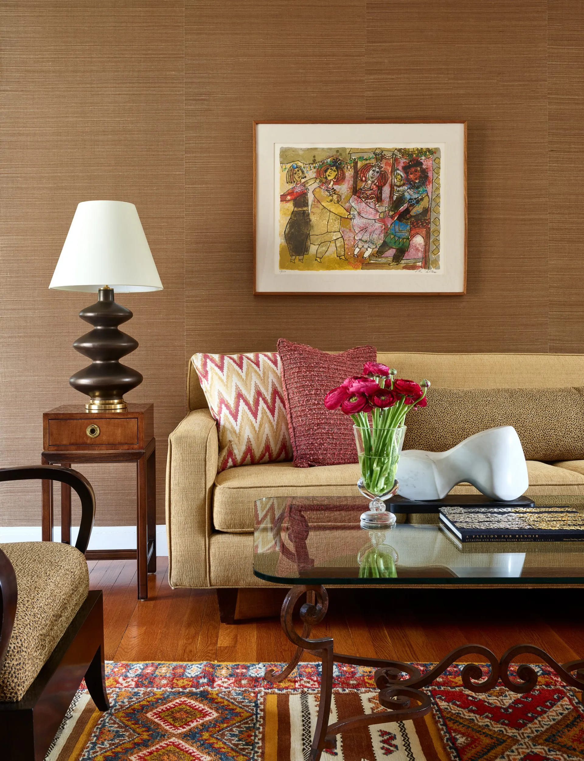
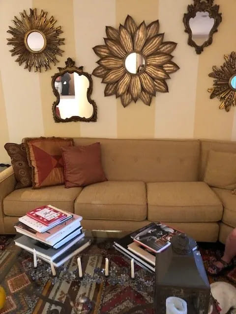
Do you have “trouble spots” in your home? Sometimes clients want to keep many items they own in a room, yet want the room to feel refreshed. My secret perspective is that if you don’t want to do a total redesign, one way to lighten and brighten a room is by adding neutral elements and textures. Neutrals are easy to live with and can unify a space. Mixing different textures adds dimension and interest, creating a cozy, warm feeling. For example, a pillow with an interesting boucle fabric mixed with a smooth metallic lamp creates an interesting juxtaposition. Recently a client wanted to update her living room, keeping the sectional, area rug and coffee table. Here’s a “before” picture.
Here’s the “after” image once again.

Overall the sectional and rug gave the room a mid-century modern feeling. The yellow and gold striped wallpaper was dated and made the sectional color look muddy. The collection of mirrors over the sectional overwhelmed the space. Since the clients wanted to keep the original sofa, the “trouble spot” was the wallpaper. I thought a grass cloth in a warm neutral color would be a good contrast to the sofa. So we chose a deep caramel colored grass cloth by Schumacher. We kept one of the mirrors for another spot in the room, and relegated the largest starburst to a bedroom in the clients’ Berkshire home and sold the rest. On one of our shopping trips, we found a print by a well-known Israeli artist which was meaningful to the wife who was born in Israel. We replaced the side table with a vintage piece from Carolann Burke Antiques and added a smooth bronze ceramic lamp by Circa Lighting to blend with the color of the grass cloth wallpaper. I like the mix of the lamp with the textured grass cloth. We styled the coffee table with a modern sculpture from Berkshire Home and Antiques and filled a vintage Steuben glass vase with hot pink ranunculus from Kelley’s at the New England Flower Exchange. Throw pillows in colors from the rug add more pattern and texture.
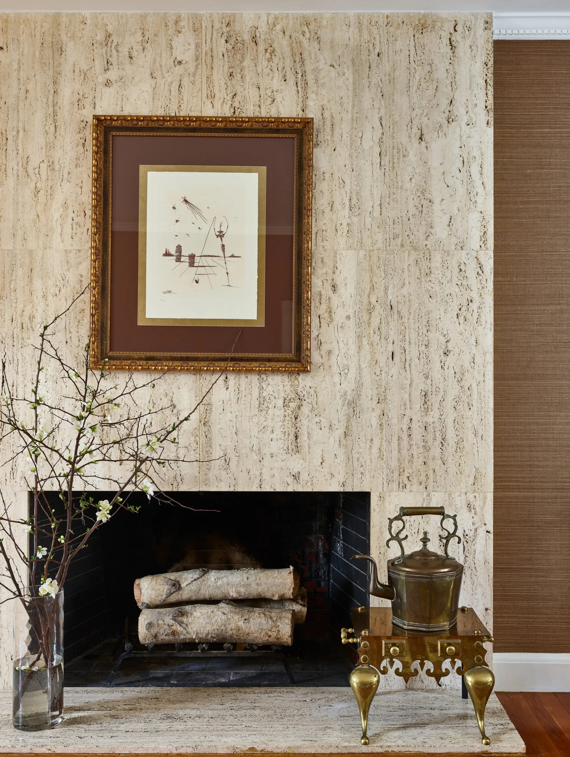
I thought that the grass cloth would also highlight the fireplace that the clients modernized years ago. What do you think? I love how all the textures work together. The darker grass cloth makes the stone fireplace surround “pop”.
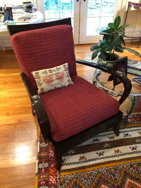
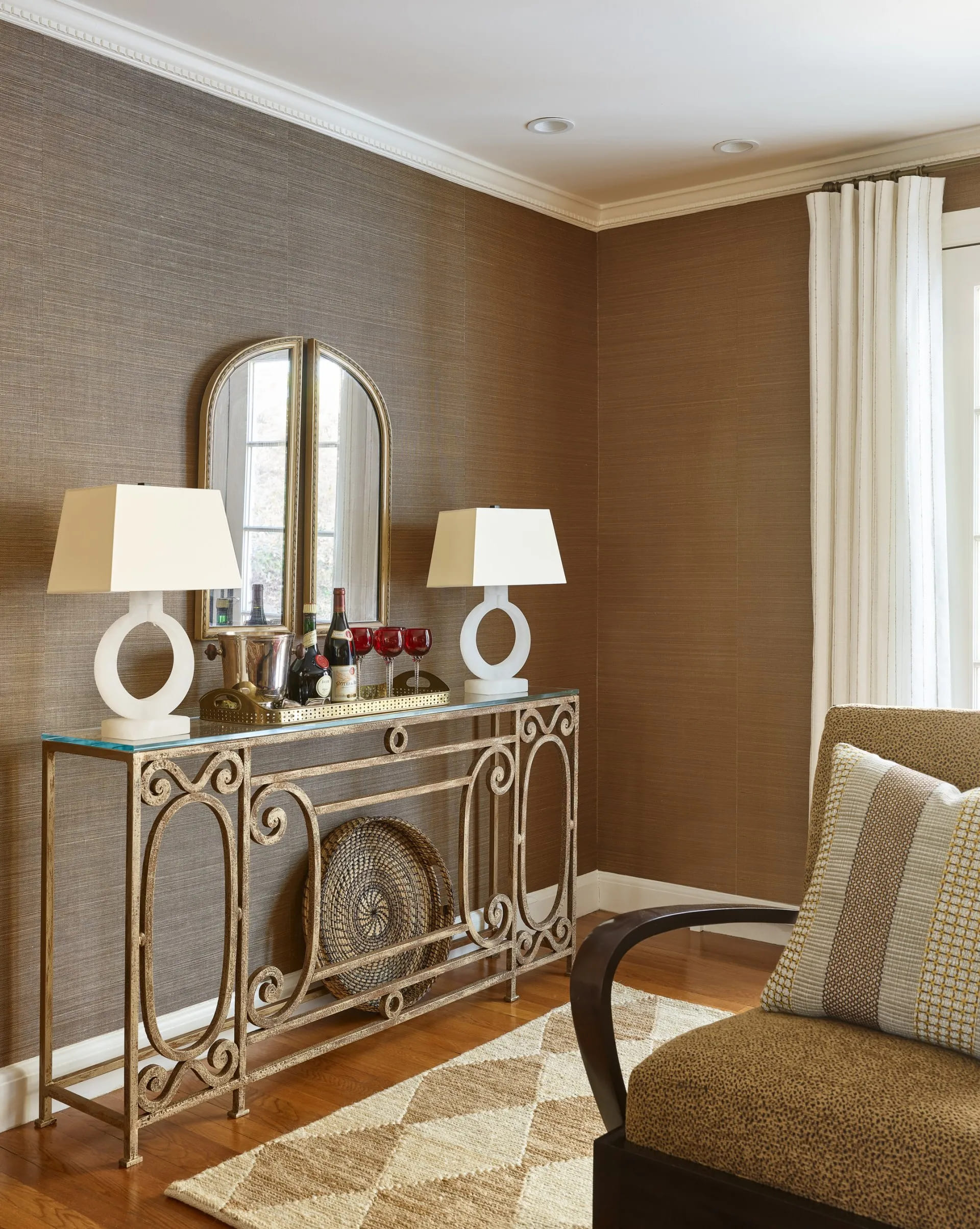
Another “before” picture. The clients had a pair of chairs which we recovered in a mini animal print fabric to pull together with the wallpaper. Behind the chair is a work table filled with “stuff”. The clients said they were never able to conceptualize this corner of the living room, so I thought it would be great to clear it out and create an area for entertaining. In this case we set up a bar. The image below shows one of the chairs as well as a beautiful console custom designed by Berkshire Home and Antiques with alabaster lamps by Circa Lighting. We added more neutrals and texture with the diamond sisal rug by Mark Sikes for Dash and Albert and softened the French door area with drapery panels in a sheer, nubby fabric by Calvin Fabrics.
The clients have a wall of bookcases with a window area in between. I asked them to go through the bookcases and only keep the things that were meaningful. They spent a weekend decluttering the area.
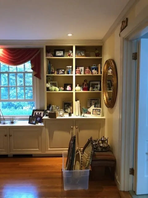
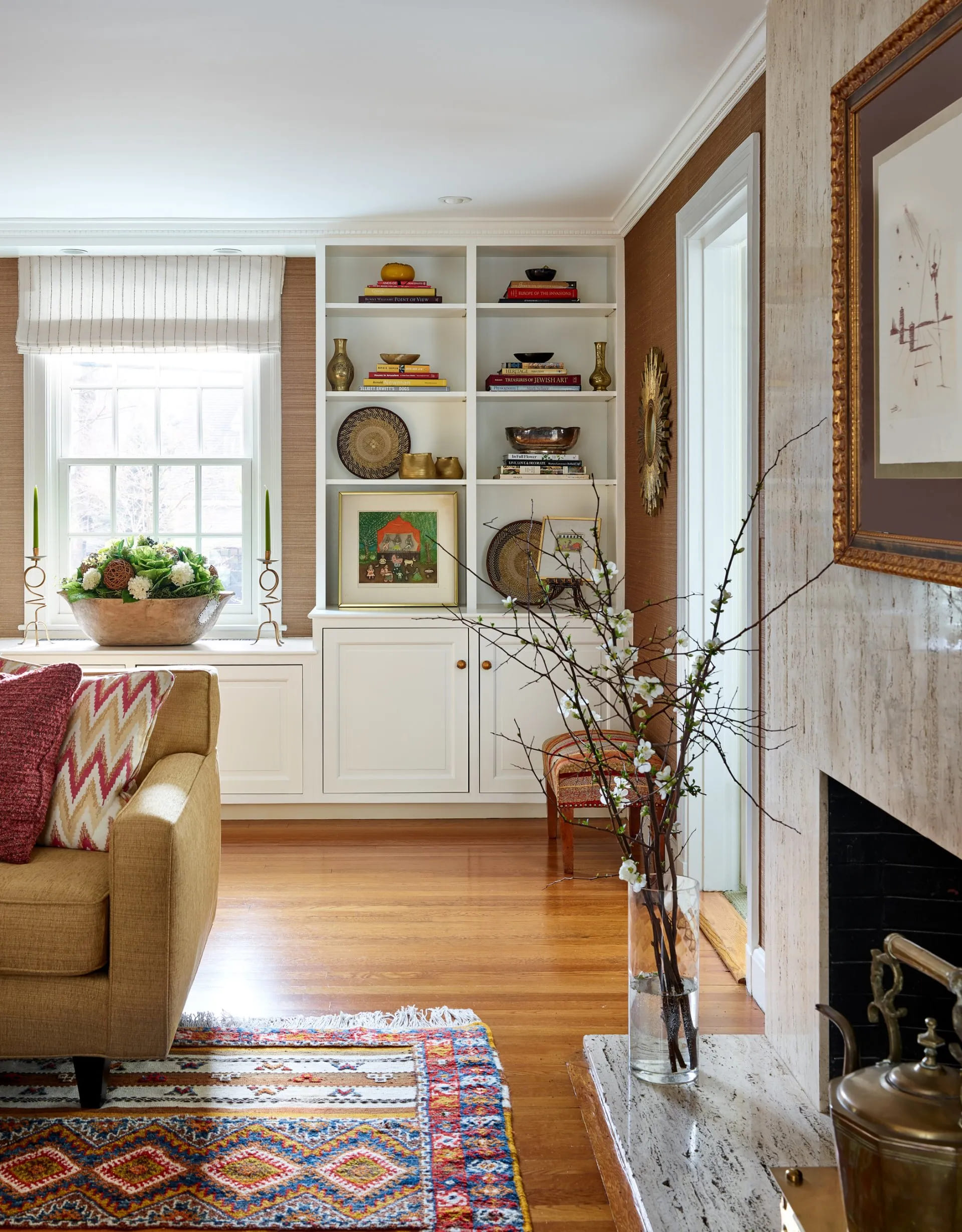
Here’s the “after” shot. We restyled the bookcases with a beautiful arrangement from Fleuri Designs in Chestnut Hill. We added a valence in that neutral sheer, nubby fabric which gives a brighter feeling to the window area.
And here is another area in the house that we refreshed.
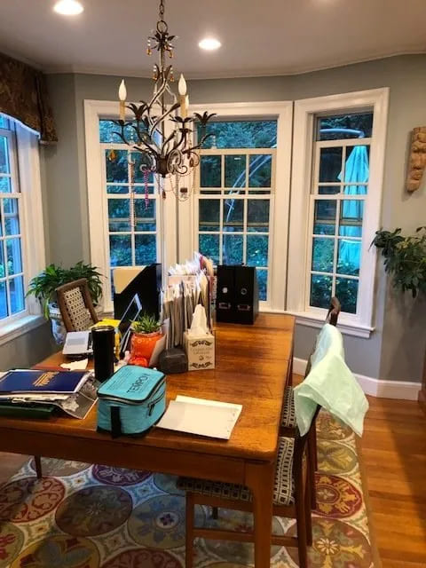
This is a “before” pic of the kitchen dining area which is right off the living room. The clients wanted to keep the dining set and chandelier. The “trouble spot” was the dark wall color and no softness around the bay window area. We had the same strategy of decluttering and adding neutrals. We repainted the area in a lighter neutral color, Benjamin Moore’s Windsbreath, recovered the chairs in a neutral metallic vinyl by Kravet and added draperies in the bay window. The drapery fabric is the same as in the living room to create continuity. We added a fun element to the chandelier with custom shades in a Schumacher fabric. See the “after” results below. I love how everything feels lighter and brighter.
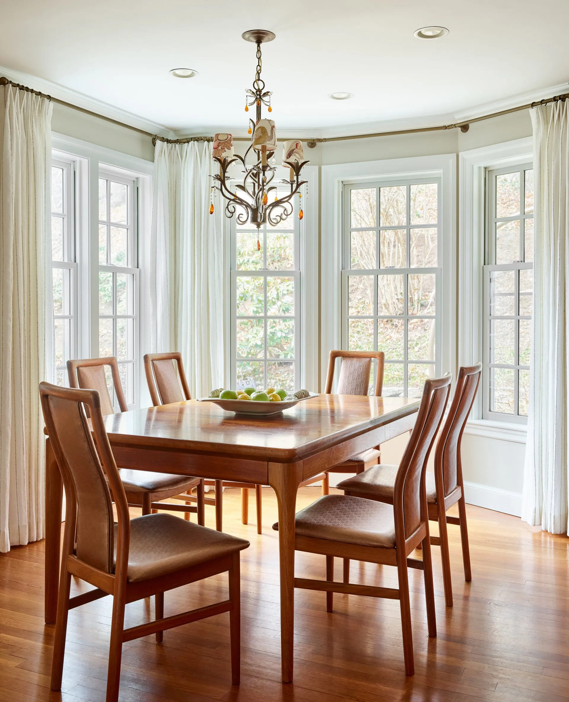
Do you have “trouble spots” that you would like to change in your home? Feel free to contact us for a design consultation. We are here to help!
“After” photos by Jared Kuzia Photography


