A Wallpaper Accent Wall Can Make a Big Difference
It’s not uncommon for a client to call to update an existing space. In this instance the client wanted to keep most of her existing dining room furniture, including her chandelier and sea grass rug, but make the room feel more current. In addition she has extensive silver and crystal collections and luckily, extensive storage and shelving options. We ended up sorting through things that should stay or go to make it all feel more manageable-and beautiful. Here are the before pictures of the space.
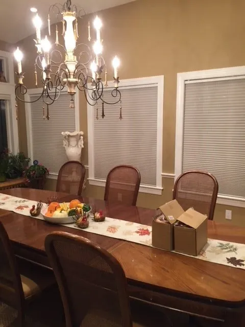
Originally this was the client’s sunroom which she converted to a dining room several years ago. The ceilings are high, and there are large windows which creates a very bright, open airy space.
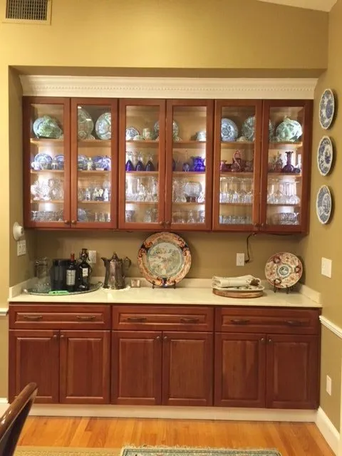
Originally there was an indoor grill in this area which the client removed and installed cabinets for storage. The creamy marble top was a remnant she found, but ending up not being crazy about it.
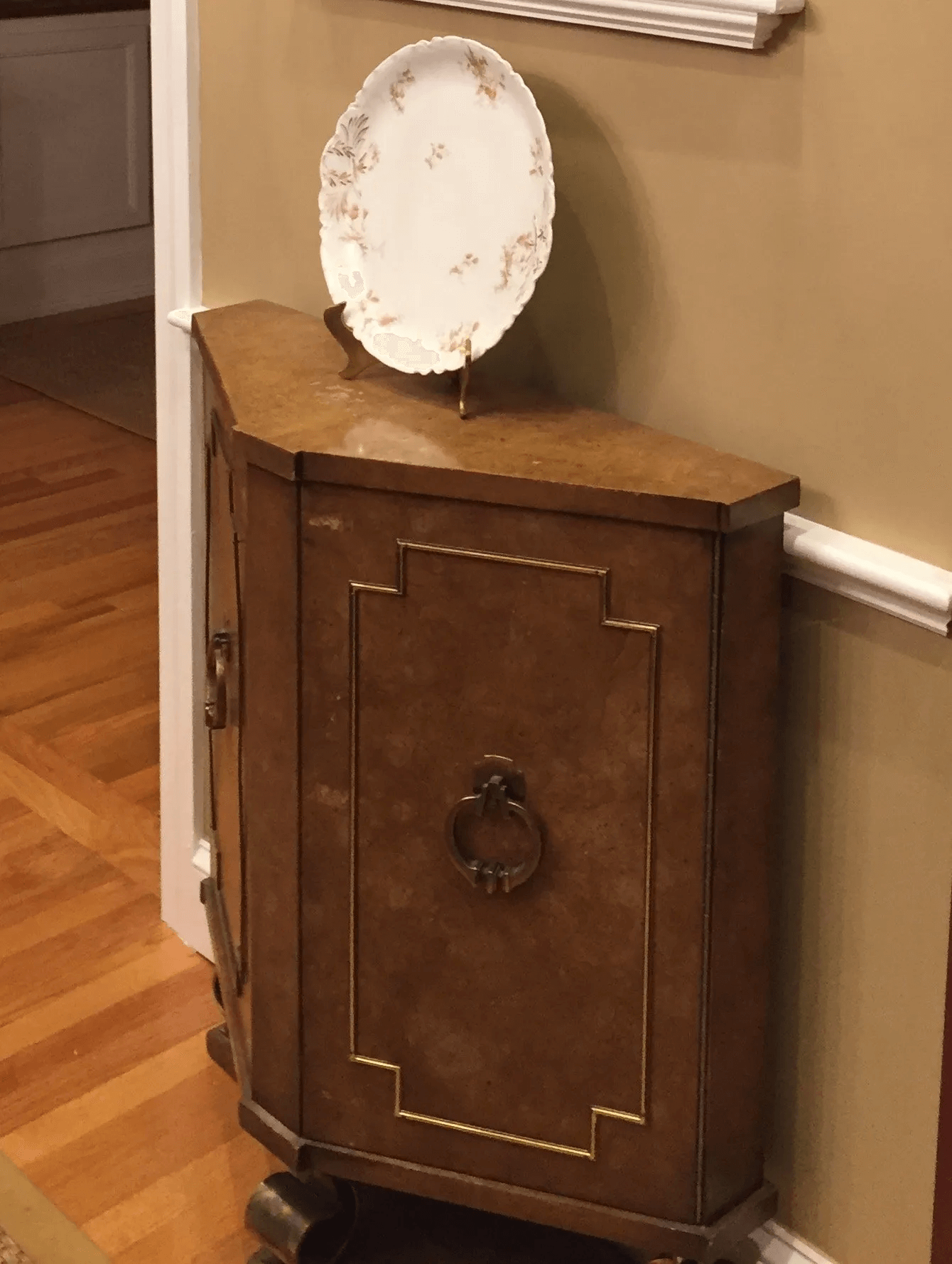
The client inherited this small cabinet from her mother and wanted to keep it for sentimental reasons.
As you can see everything in the room is brown and gold and feels out of date. I suggested we consider a wallpaper accent wall with a nature theme, reflecting her love of the outdoors and then paint the other walls, the large built-in cabinet, and her mother’s small cabinet to pull it all together.
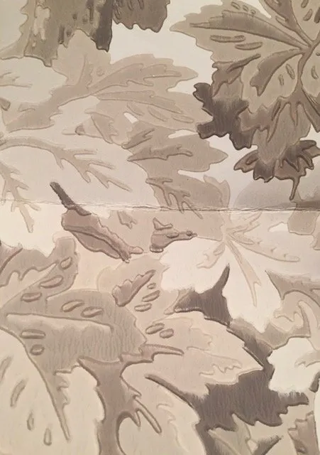
Knowing the client’s love of nature, I thought she would fall in love with this Cole & Son paper and she did. With this, the decision was made to go with a neutral color palette for the dining room and use accent colors of blue and gold in the art work. We used Benjamin Moore’s Wind’s Breath for the other walls and ceiling, and Benjamin Moore’s Stone Hearth for the built-in cabinets and small chest. The crown molding was painted in Benjamin Moore Chantilly Lace. We also painted the living room walls and trim the same colors to create a coordinated sight line between the two rooms!
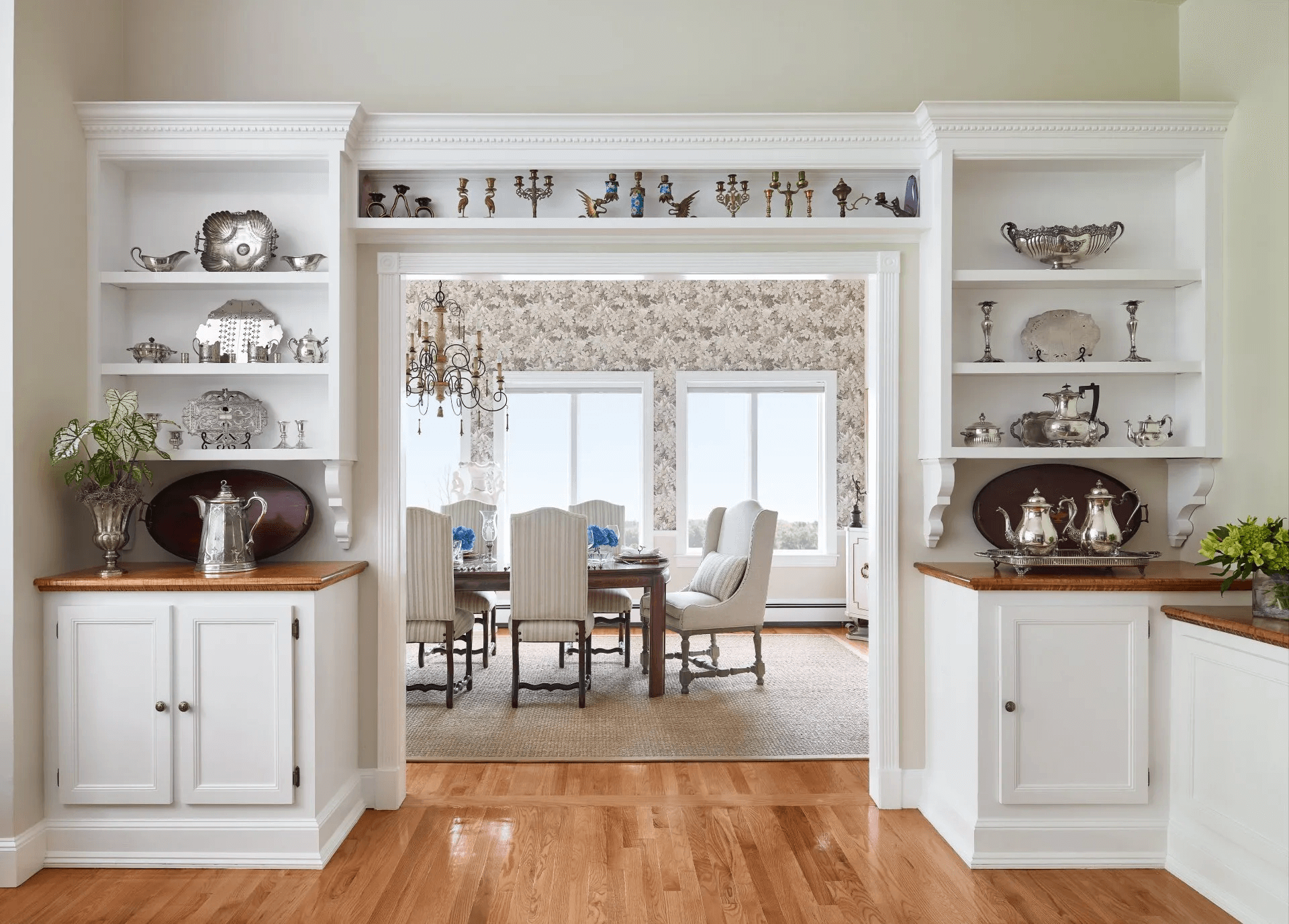
Looking into the dining room from the living room, there are built-in shelves and cabinets painted in Benjamin Moore Chantilly Lace. We organized the client’s silver collection to highlight her favorite pieces. The built-ins frame the dining room just beautifully.
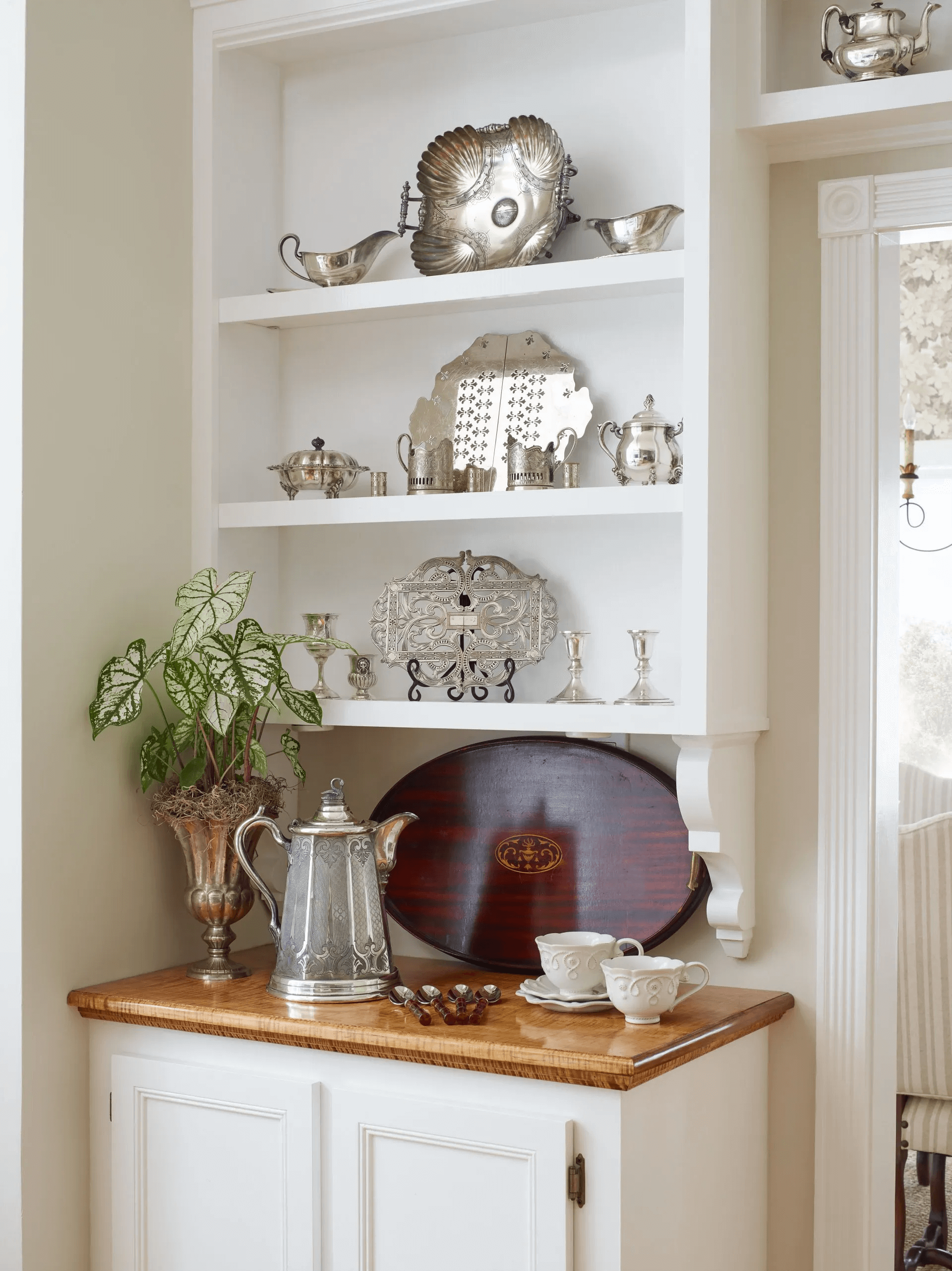
Here’s a close up. Check out the beautiful tiger maple counters, the vintage silver plus the serving tray with an inlay design mixed with Juliska’s Jardin du Monde. It’s classic and modern at the same time.
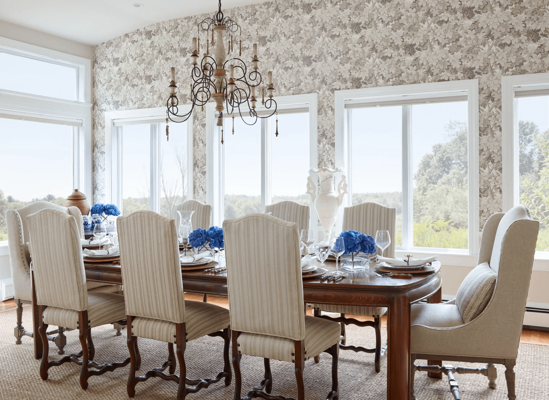
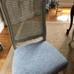
Once inside the dining room, we get a closer look at the feature wall with the Cole & Son wallpaper. We also replaced the client’s wood chairs with upholstered French country chairs to soften the space. The French Country side chairs in a modern, neutral stripe reflect the client’s love of mixing traditional and modern. These side chairs are from Berkshire Home and Antiques, and they go beautifully with the client’s chandelier. The host and hostess chairs were a great find at Home Goods, and we customized accent pillows for them in a Fabricut fabric.
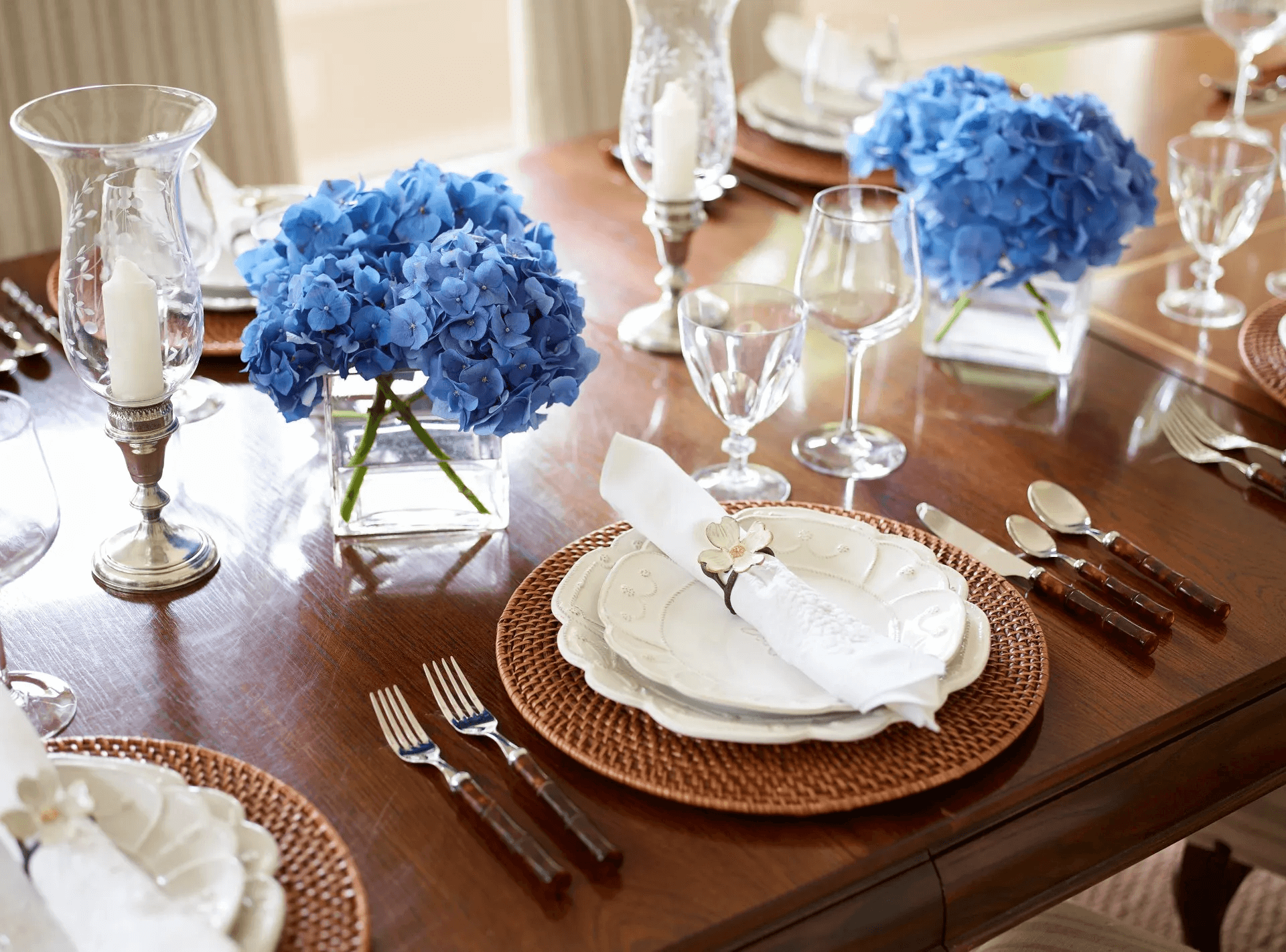
Who doesn’t love to set the table? We used the Juliska Jardin du Monde with wicker placemats and flatware from Ballard Design along with vintage Belgian linen napkins and contemporary napkin rings from Micheal Aram. The glassware and silver candle sticks are vintage as well. The gorgeous blue hydrangeas are from the Boston Flower Market. We conditioned them carefully, and they lasted for days!
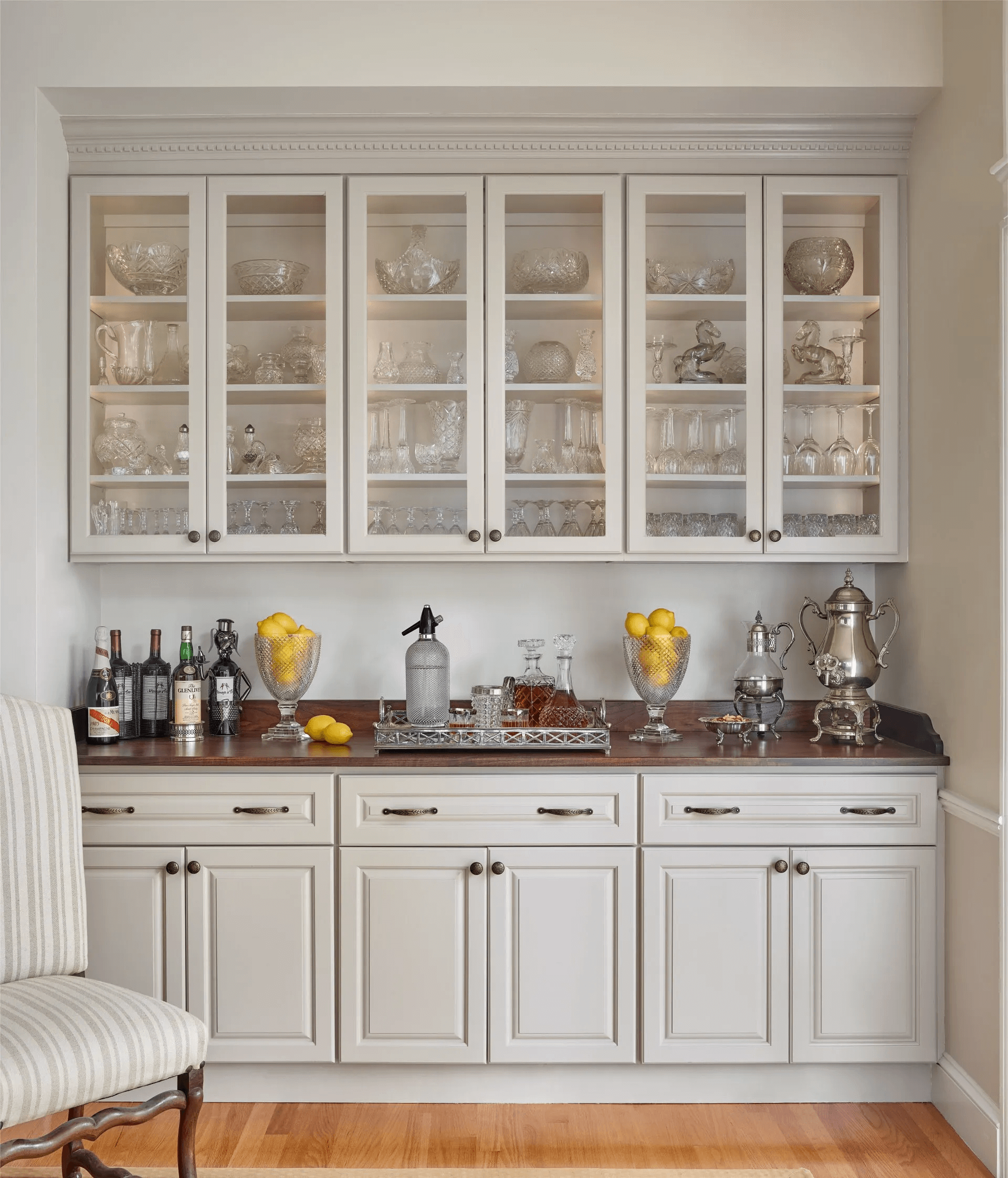
I was so pleased how the cabinets were transformed with Benjamin Moore’s Stone Hearth! We changed out the marble to a beautiful custom walnut counter to warm up the space. We organized the client’s crystal, glassware and barware which she uses extensively for entertaining.
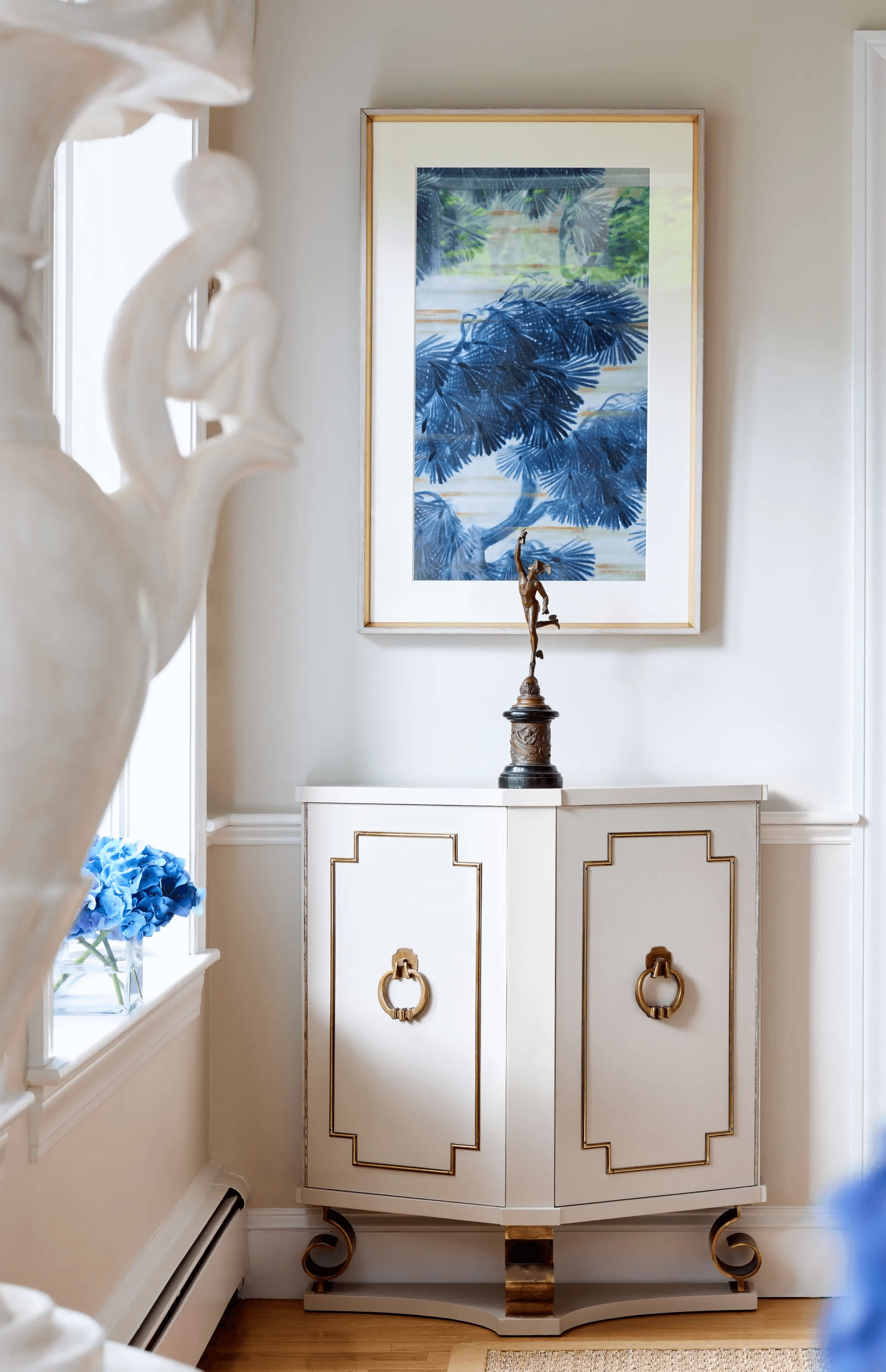
The client painted her mother’s cabinet in Ben Moore Stone Hearth, and it came out perfectly! We chose to place an interesting statue of Mercury from her collection on the cabinet. The handle of a marble vase in the foreground is from the client’s collection as well. The artwork is a print by Curated Kravet, and there is a coordinating one on the other side of the door which I will show you right now!
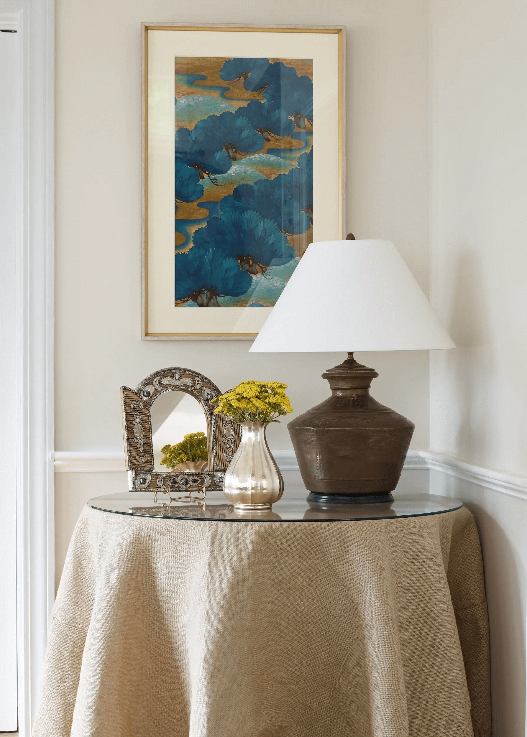
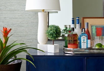
This beautiful table vignette has a very reasonably priced Ballard Design fringed burlap tablecloth with a glass topper. It is mixed with a bronze vintage lamp from Berkshire Home and Antiques, a Moroccan mirror and a vintage Italian art deco silver vase filled with yellow yarrow flowers. The framed print is from Curated Kravet.
Feel free to comment below, and if you would like to update a space in your own home contact me at lwinteriorsnewton@gmail.com
Photography by Jared Kuzia


