Cozy Guest Bedroom and Bath Refresh FINAL REVEAL!
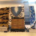
It’s Week 6 of The One Room Challenge, a bi-annual online design event held every April and October. Each time twenty featured design bloggers from around the country take the challenge to design a space in six weeks and blog about the design process to their readers on Wednesdays. Guest participants link their room transformations with the event on Thursdays. This time around Better Homes and Gardens is also sponsoring the event. Last fall was the first time I participated in the One Room Challenge where I updated the master bedroom in our 90 year old Tudor home. It was a great experience, and I’ve been excited to take the challenge again. It’s Week 6 and time for my Cozy Guest Bedroom and Bath Refresh Final Reveal! Here is my mood board for the project!
![Gould+bathroom+[autosaved] 2350fd94 1920w](https://lwinteriors.com/wp-content/uploads/2021/09/GouldBathroomAutosaved-2350fd94-1920w.jpg)
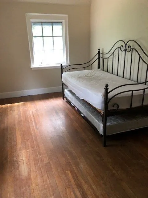
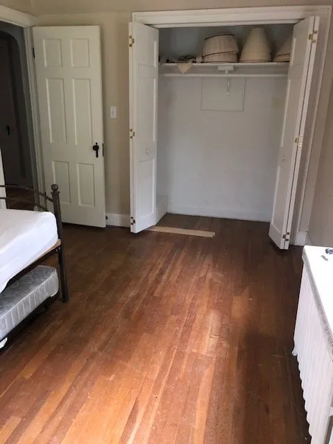
This is the smallest bedroom in our 1928 Tudor home. It has always been used as a guest room/office over the years. The One Room Challenge motivated me to refresh the room as well as the adjoining bathroom. Do you remember the “before” pics of the guest bedroom and bath from the Week 1 post? Here they are again. If you recall I pulled up the rug and saw that the floors not only needed refinishing, but also repair. I replaced the trundle bed with a Charles P. Rogers Campaign Day Bed which has cleaner lines. The trundle mechanism from the old bed fit perfectly under the new one, so I only purchased the bedframe.
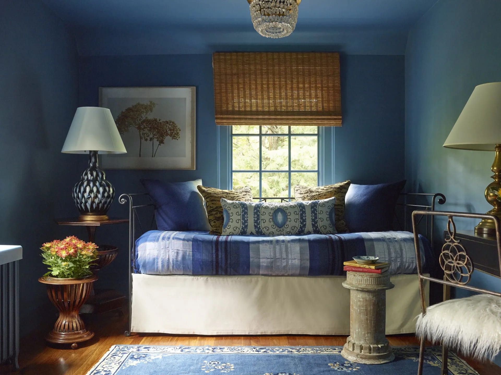
See how the guest bedroom looks now!
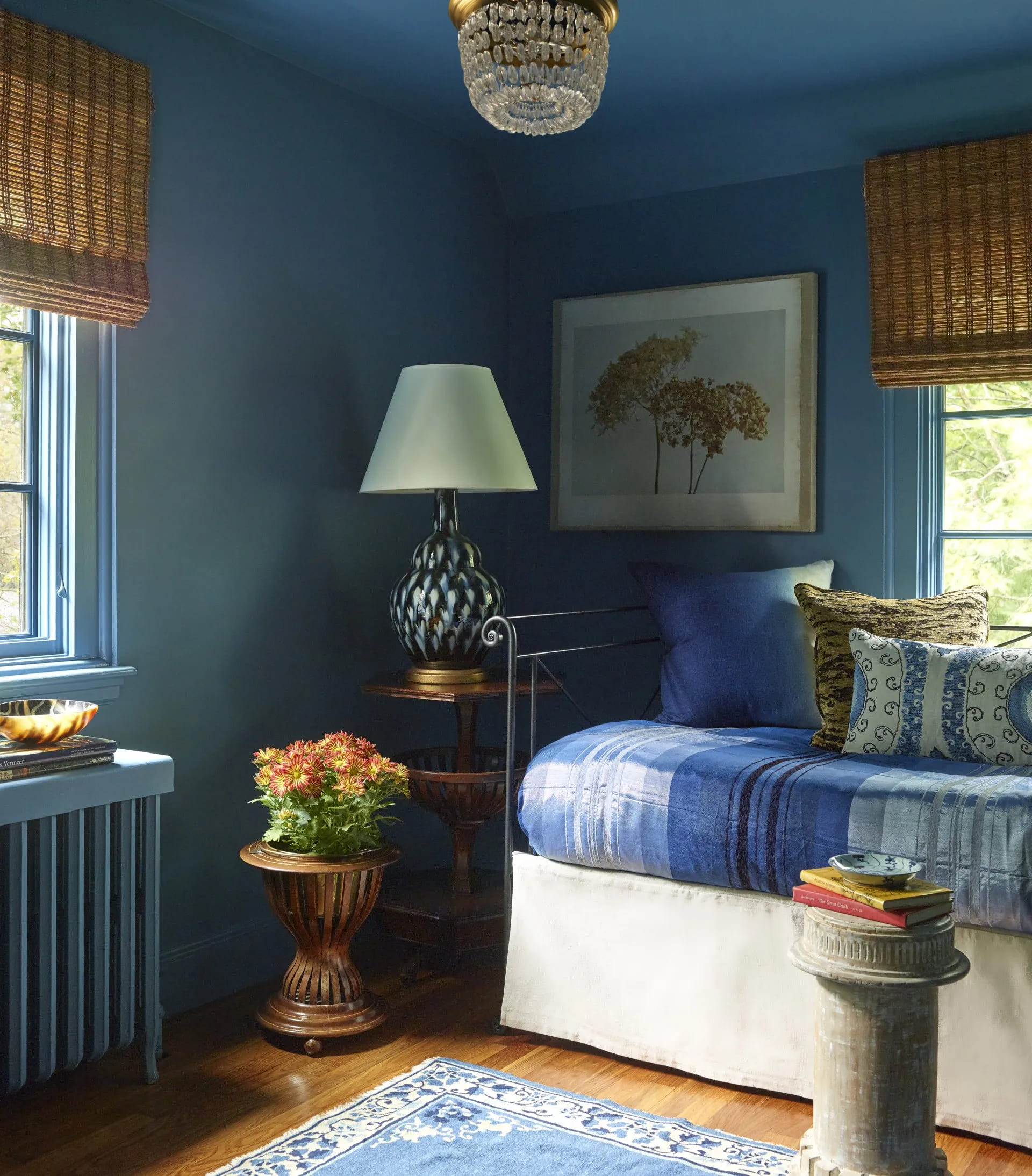
I like to experiment with dark colors and chose a rich blue for the walls and ceiling. The ceiling curves and blends into the walls on two sides creating different ceiling lines, so painting it all the same color made those lines disappear. The warm tones of the window shades, hardwood floors and animal print pillows provide a warm contrast to the cool blue tones of the walls and vintage Chinese Art Deco rug. I bought the bedspread in Morocco on a trip in 2014. Rug and column side table by Berkshire Home and Antiques. Trundle bed and bed skirt by Charles P. Rogers. Blue ombre alpaca pillows by Mackimmee Co. in Lenox, MA. Lamp by Bunny Williams Home. Animal print pillow fabric by Schumacher and suzani lumbar fabric by Anna French/Thibaut. Woven wooden shades by The Shade Store. Ceiling fixture from Visual Comfort. Planter and bedside table are from my private collection. Hydrangea #6 art by Caroline Kaars Sypesteyn in Great Barrington, MA.

The ceiling line is lower over the window on the right than it is on the left. There was much discussion how to coordinate hanging the woven wood shades. The shade over the bed was hung to the ceiling line and the the shade over the radiator was installed at the same height, even though the ceiling is higher on that side of the room.
You can also see the details in the bed, vintage side table and antique plant container. I saw a similar planter in an antique store in Belgium. It has a copper pot that’s inserted inside. I’ve always loved the details of the construction. The closeup also includes the radiator in the room which we painted blue. The house is ninety years old, and we still have the original radiators in two of the bedrooms. Painted, they look sculptural. At some point I might buy covers for them, but for right now, they’ll stay as is.
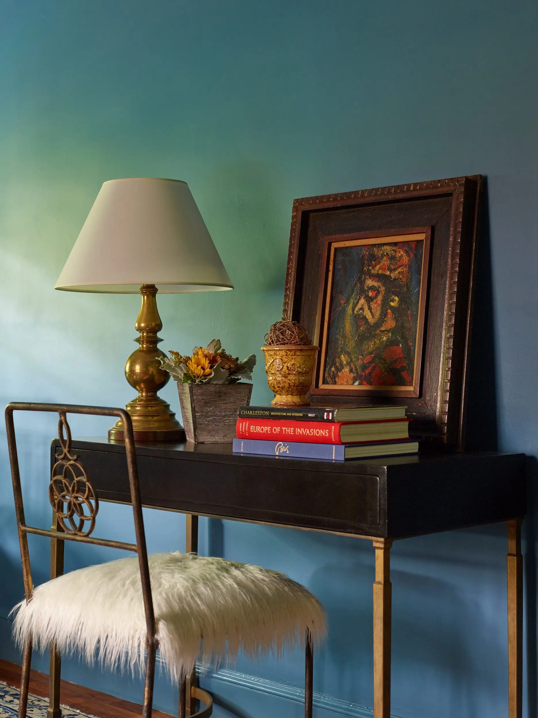
Here’s a photo of the desk area. Look how the light from the window on the left reflects upon the wall. I love mixing blue and black with gold metal tones. The desk is a metal base with a box-like top paired with a metal chair covered in faux shearling. The desk, chair and Anduz pot are from Berkshire Home and Antiques. The painting is in the style or from the workshop of French modernist painter Georges Roualt (1871-1958)-also from my personal collection.
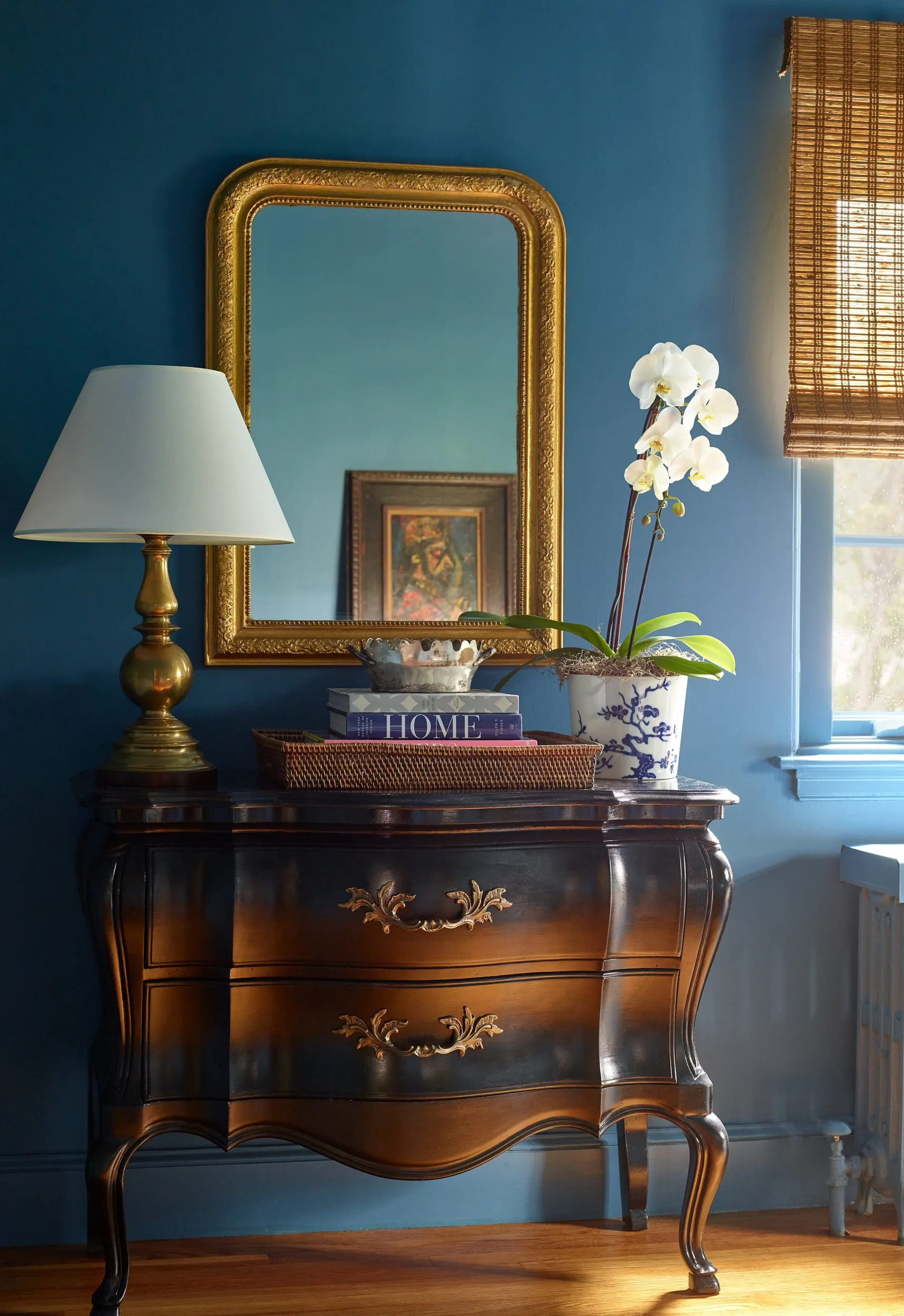
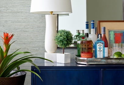
There is room for storage with a vintage French Bombay chest of drawers that I painted black. The reflection of the light gives it a gold glow, but it is lacquered black. I added a Louis Phillipe mirror from my personal collection, a tray, some books, a vintage Fitz and Floyd pot holding an orchid and a brass lamp for a cozy feeling. I love how the Roualt painting on the other side of the room is reflected in the mirror-thanks to the great eye of Jared Kuzia!
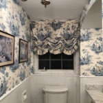
Here are the before and after pics of the bathroom. I still love the toile style, but the wallpaper was peeling off the wall, and the window shade was stained and dated. Change is good, right?
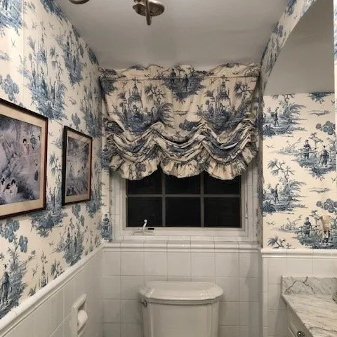
Years ago the toilet was tucked in the corner where the sink is now. When I decided to renovate the bathroom, I wanted a larger vanity. Since the bathroom is a small and narrow and there were no spaces from which to steal more square footage, the only place to install the toilet was where it is right now. So walking in you see the toilet front and center. I’d like to think that the refresh helped the situation, and I think it did!
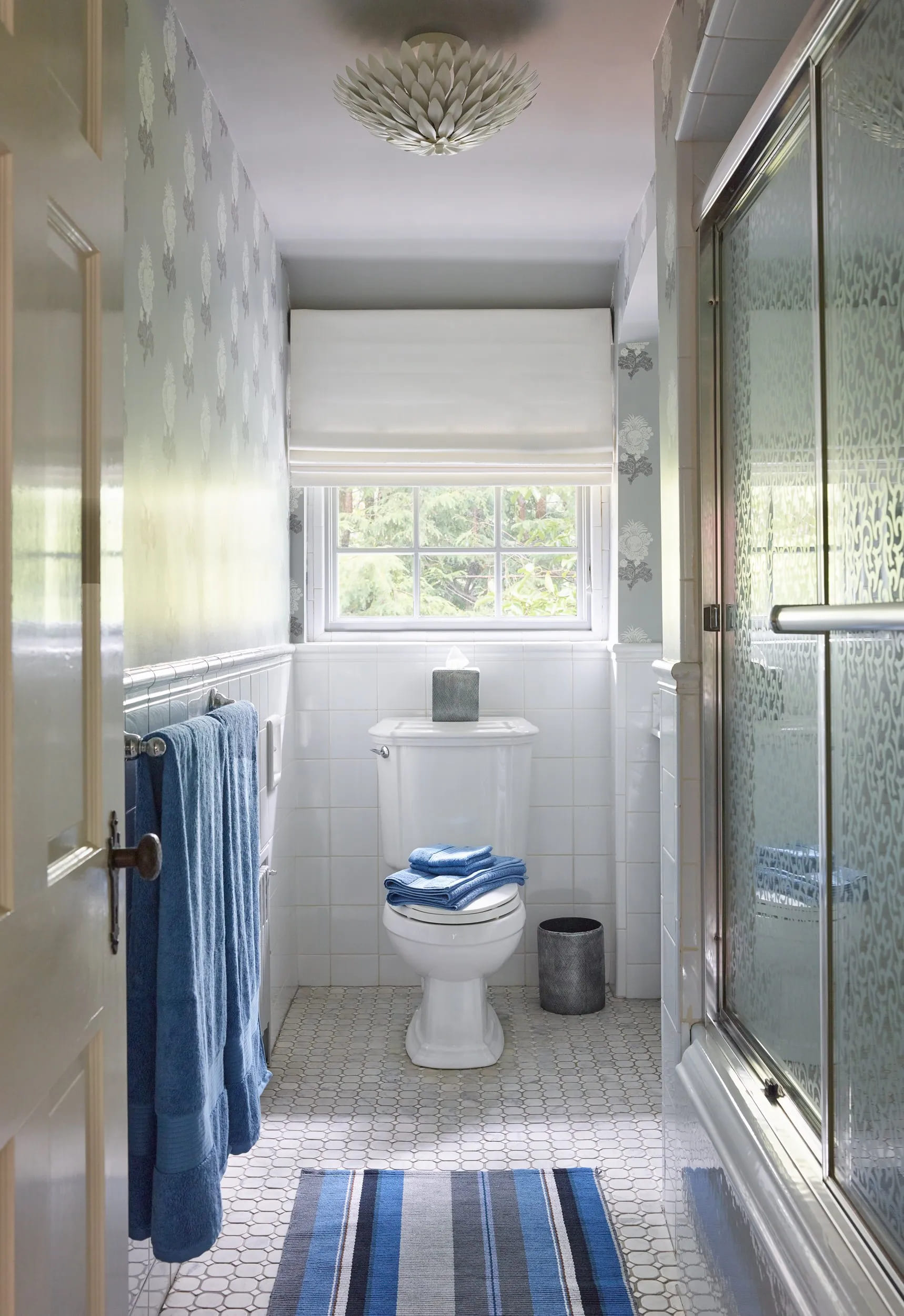
Since the rooms are next to one another, I wanted to tie them together color-wise so I added a blue and gray striped rug and fresh blue towels in the bathroom. Rug by Dash and Albert. Towels by Ralph Lauren from Bloomingdales. Ceiling flush mount by Crystorama, a sponsor of the One Room Challenge.
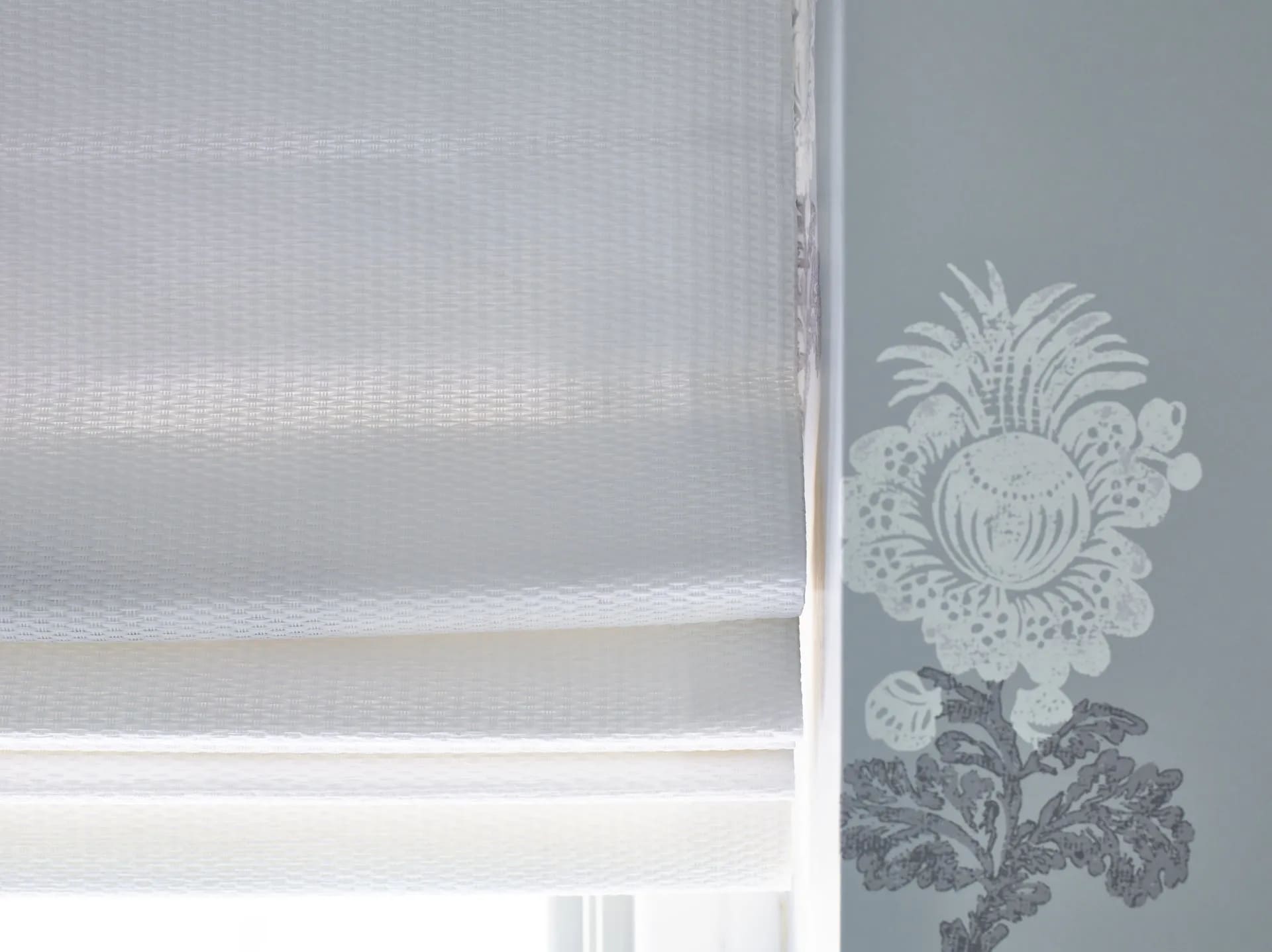
Here’s a close up of the woven wood shade from The Shade Store and the Thibaut Aldith wallpaper. The paper also has a coordinating fabric that goes with it, but I didn’t want to go the same route I did years ago with matching wallpaper and window treatment. I love how the texture of the shade plays off the paper’s motif.
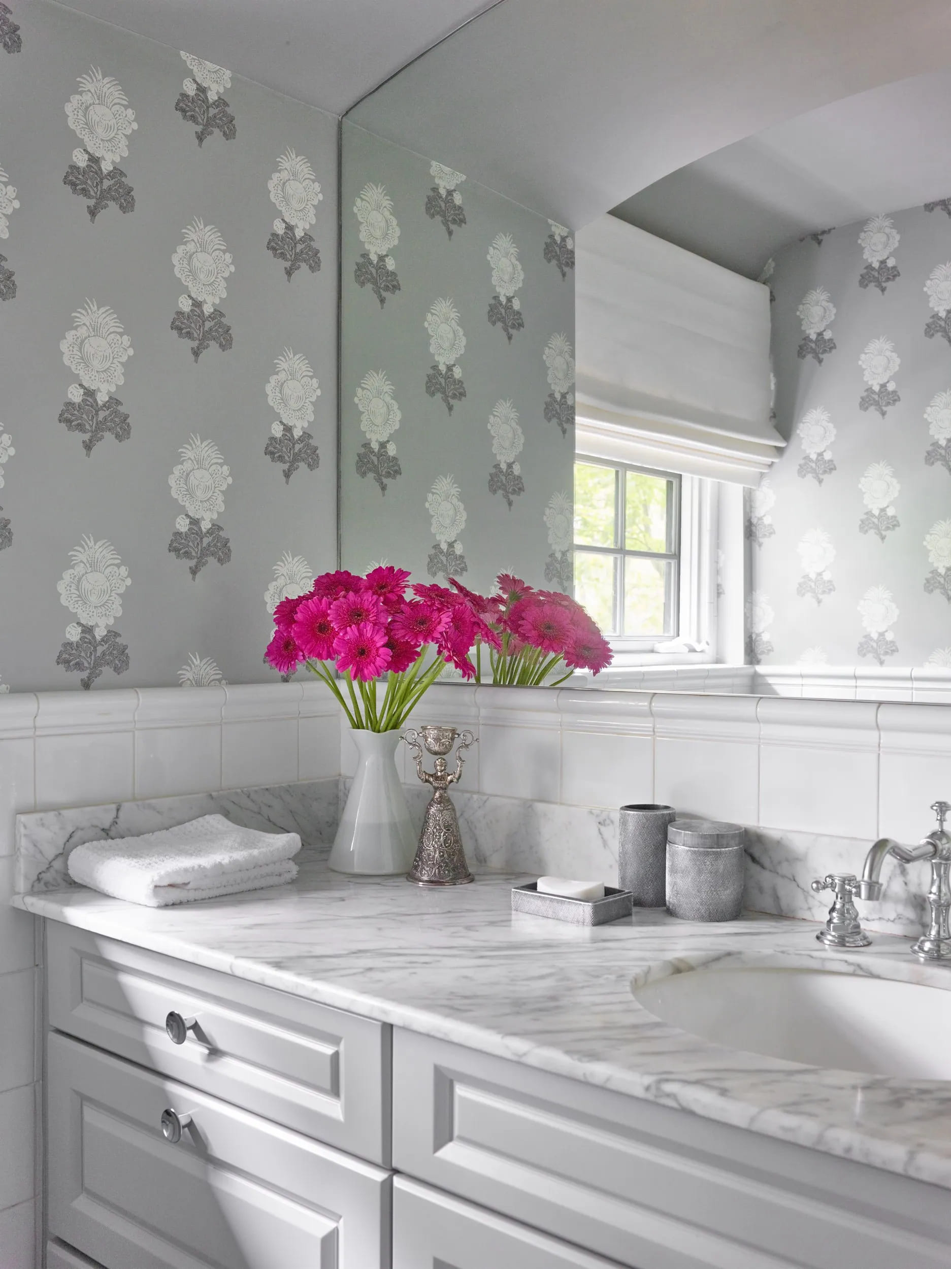
This is my favorite pic of the refreshed bathroom-with a pop of another of my favorite colors – hot pink! The Thibaut wallpaper pulls together the gray tones in the Carrara marble and the white sink. I cleaned up the marble stains, added new bath accessories from Kassatex and white towels from Home Goods. A vintage silver candle holder from my personal collection sits next to the hot pink gerberas in a milk glass container. The cabinets repainted in
Ben Moore Coventry Gray look lighter because of the light from the window. I kept the vintage chrome faucet set as it still “works” with the style of the house. The new cabinet pulls are from Rejuvenation. Luckily for this project I had classic materials in good condition to begin with, so the bathroom refresh was mostly cosmetic.

Thank you again to Linda of the One Room Challenge and media partners Better Homes and Gardens and
Home Love Network. It’s been a great experience to watch the projects of other participants. Link up here to see the final reveals of the One Room Challenge featured designers and guest participants. Thanks again for following my Cozy Guest Bedroom and Bath Refresh project!
Photography by Jared Kuzia


![Gould+bathroom+[autosaved] 2350fd94 1920w](https://lwinteriors.com/wp-content/uploads/2021/09/GouldBathroomAutosaved-2350fd94-1920w-150x150.jpg)
