A few years ago, we started to feel we needed more room in our Lenox, MA country house.
The family was expanding, and we needed more sleeping, living, and storage space. I looked at some larger properties, but since we loved the location and the natural light in our house, we decided to add on.
In Phase Two, we refigured and maximized square footage available in underutilized areas of the original house.
In the summer of 2019, I interviewed two architects and chose one who understood exactly what we wanted: Jim Harwood in Lenox.
It took about eight months to work on the design and construction documents and find a builder. We also needed approval from our association.
By March 2020, locked down by the pandemic, we debated if we should even move forward.
I’m very glad that we did! At that point, there was plenty of stock and few supply chain or inflationary problems.
Whenever I look at a project, two questions come to mind:
- How does one want to live in a space?
- What is the feeling you want to have in that space?
Adding more space for work, sleeping, and storage was our goal. Connection to nature in a quiet environment was the feeling we were looking for.
We ended up adding a bedroom, bath, and sleeping loft. We also expanded the front entryway with windows on both sides to connect the addition to the original structure and bring in plenty of natural light.
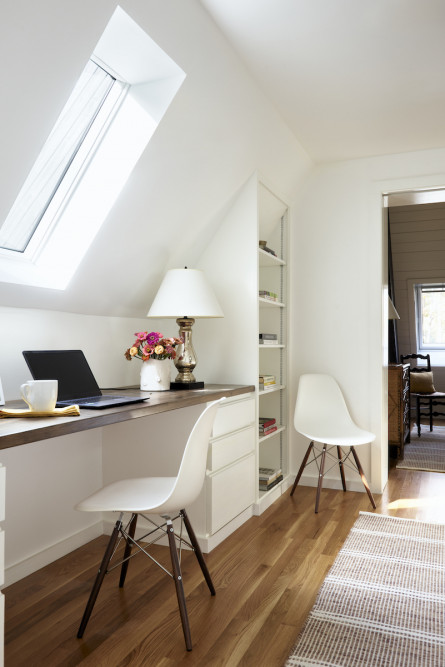
On the second floor above the entry, we originally planned a reading nook, but once Covid took hold, I thought that space would be better utilized as an office area with a skylight. Beyond that is the sleeping loft overlooking the bedroom downstairs.
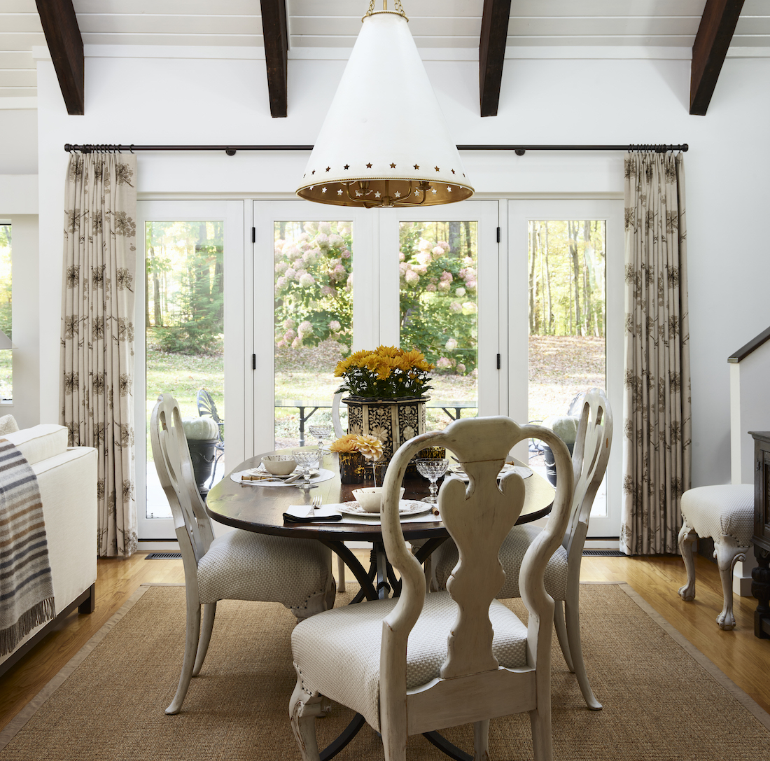
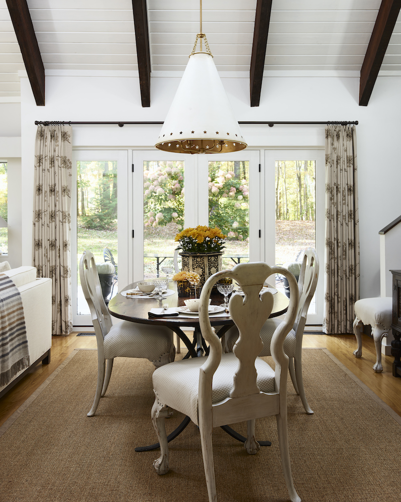
We also replaced the dining room windows with doors leading to a new patio in the back of the house to extend space for entertaining in warm weather. And because of the sightline with the sunroom that had sliding doors to a side patio, we replaced those as well to unify the space.
Take a look at some before and after exterior pictures of the front and back of the house…
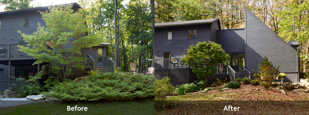
Before, the entrance was very small, and we paid no attention to the wooded area of the property on that side.
We went back and forth about adding windows in the front. I decided that I wanted the addition to mirror the other side which does not have windows.
It looks a bit austere, but consistent. We kept the dogwood in front and did preliminary landscaping.
My favorite is a sculptural pine tree on the right which looks great all year round. We will install more plantings this summer to soften the effect.
There is also a deck in front which is off the kitchen. We refashioned the deck railings and under it with horizontal slats that follow the lines of the siding. I kept the exterior color the same as before—Benjamin Moore Wrought Iron.
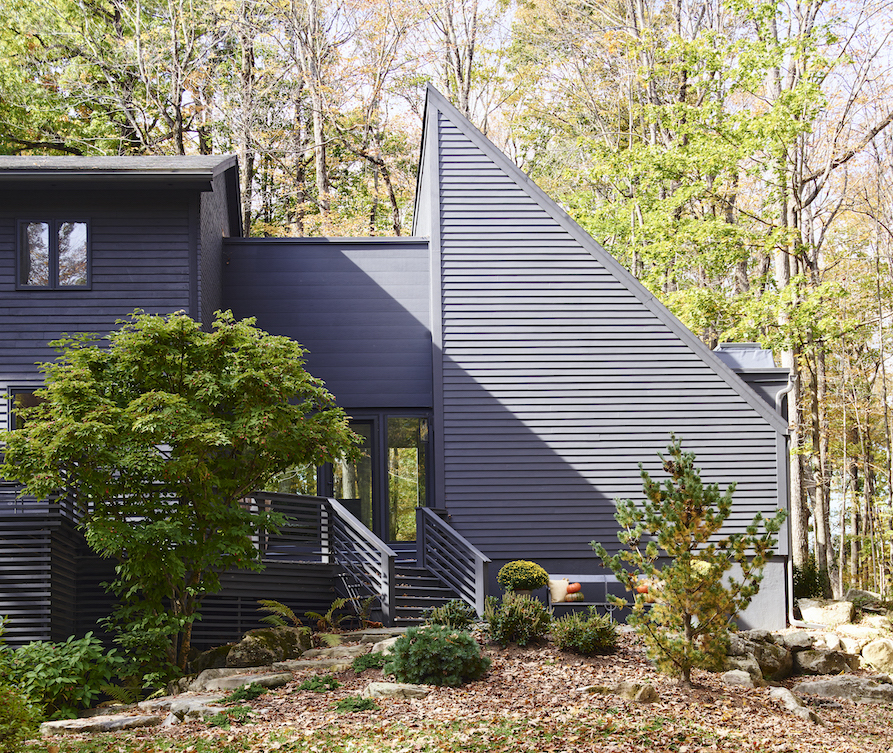
As you can see in the before below, the house looked unbalanced, as it was larger on one side than the other.
We pushed out on the left side to create asymmetric balance—it looks like the opposite side, but it’s not the same size. Our neighbors say it looks as if the addition was always there!
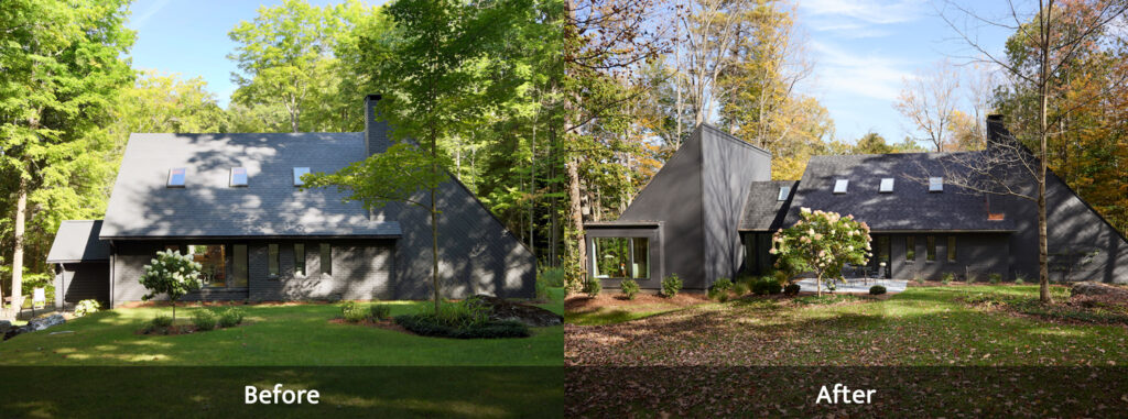
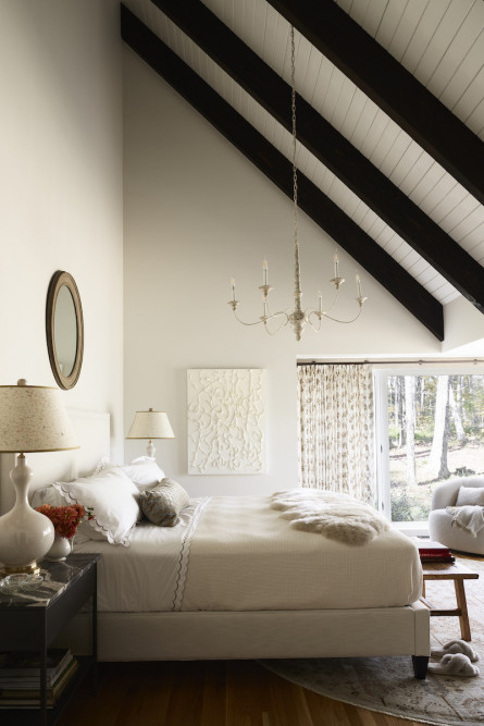
There are two 10’ windows in the new bedroom, one of which faces a wooded area of the property, bringing the outdoors inside in a big way.
The expanded entrance has windows on both sides allowing you to see from the back through the front. On the right, we added French doors and a patio off the existing dining room to open to the outdoors.
All windows and doors are by Pella.
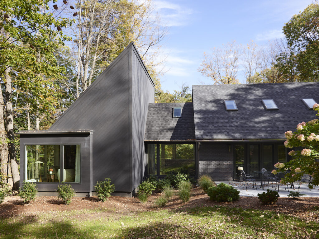
The new bedroom has two 10-foot-wide windows that open to a wooded view of the property.
In deciding the color palette of the bedroom, I went back and forth.
I love decorating with color, but I decided to go with neutrals and textures and let the outside be the focal point.
To coordinate with the rest of the house, we installed a sloped ceiling with painted wood boards and dark beams.
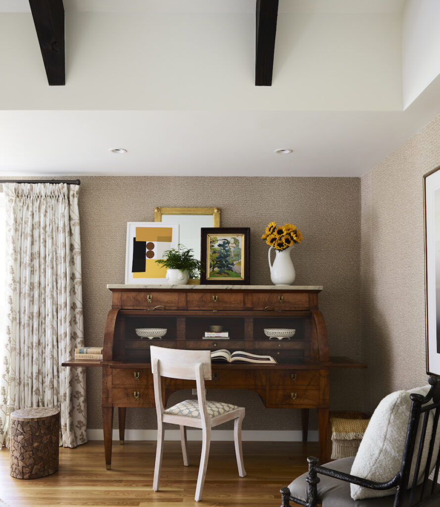
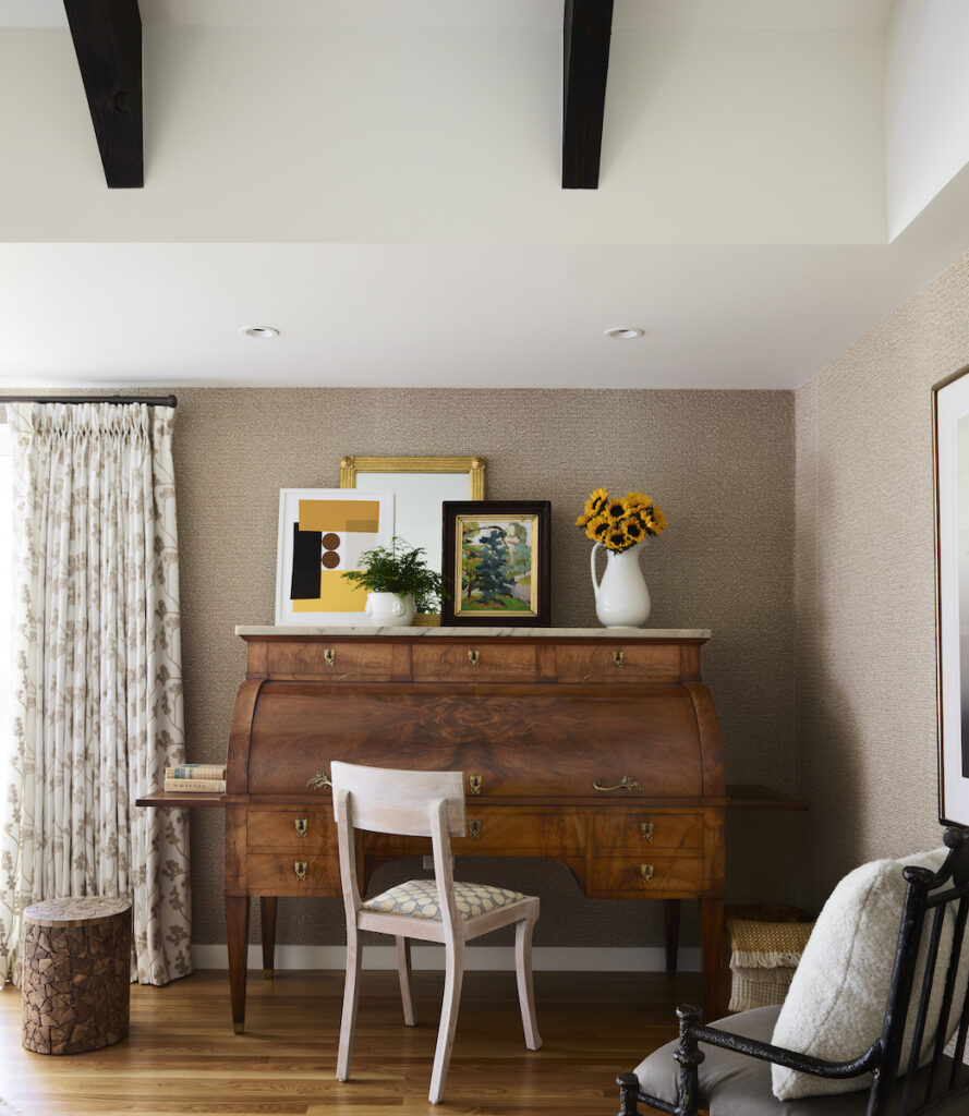
The first thing I found for this room was a mid-19th cylinder desk from France in the Directoire Neoclassical style.
The style is from the short Directoire period in France from 1889 to 1904. Because the neoclassical style continued to be popular in 19th century Europe, many desks like this one were made during that time.
I loved the size, its elegance, the book-matched wood on the cylinder top, and the numerous drawers, each with its own key.
When it’s open, the desk has a large work area, plenty of drawer and shelf space, and even a file drawer (who would have thought!) The desk could have a blog post on its own!
On the desk, I grouped an antique mirror, a modern print by Liz Roache, and an oil painting by Mary Breneman, a Hudson NY artist.
When the walls were up in the bedroom, I saw that there was an indentation on three sides of the room.
To add warmth and texture to the space, I created an accent area with Phillip Jeffries textured wallpaper that resembles tree bark.
The question was: How am I going to incorporate this huge antique desk into a modern house?!
I thought to use the clean straight legs of the desk and the rolled top as inspiration for the other items in the room. My solution was to choose items with simple lines and round curves in neutral tones with texture.
I’m happy to share the sources!
- The upholstered bed in a Perennials performance fabric is by Lee Industries.
- We customized the metal nightstands with marble tops from makers in the Berkshires.
- Lamps and chandelier: Circa Lighting
- Rug: Landry and Arcari
- The drapery fabric with a tree of life motif is from Casamance at the Martin Group and fabricated by Makkas.
- Swivel chairs: CB2
- Oval mirror above the bed: Autrefois Antiques
- Artwork: Finch Hudson
- Custom lampshades and finials: Shandell’s in Sheffield, MA
- Bedding: Matouk
- Sheepskin throw and chair cushions: MacKimmie Co.
- Lumbar fabric: Schumacher
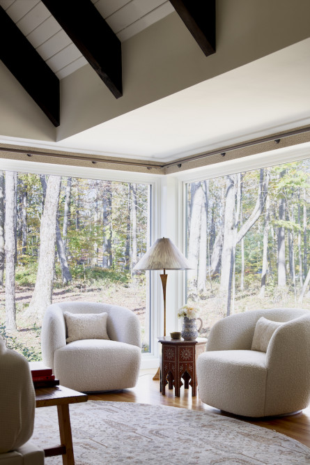
I was debating if I should put a small sectional in the corner of the room near the windows, but then thought it would be nice to have swivel chairs to look out the window while having coffee in the morning or a contemplative moment during the day.
I love how the lines of the modern swivel chairs mirror the cylinder feature of the desk. A great mix of old and new!
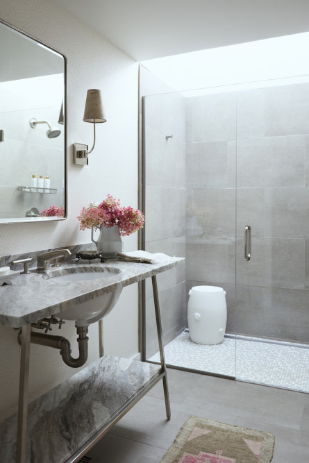
The bathroom is a nod to the mid-century origins of the house which was built in the 1970s.
The bathroom is in the front of the house where I didn’t want any windows. To get natural light we decided to put a skylight above the shower.
It has a strip of LED lights hidden above the shower door to provide lighting at night.
Bathroom sources include:
- Tile: Porcelanosa
- Washstand and sink faucets: Waterworks
- Sconces: Circa lighting
- Shower fixtures: Kohler
- Ceramic stool: Christopher Spitzmiller
- Medicine cabinet: Pottery Barn
- Leathered Brown Fantasy countertop: Lee Tile and Stone
- Textured wallpaper: Phillip Jeffries
- Marbleized sconce shades: Shandell’s
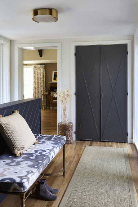
The foyer was enlarged with windows on each side.
One day I was out front, and the sun was setting at a point where it illuminated the foyer. It was beautiful.
We customized metal closet doors with a classic X motif and spray painted them dark gray. The flush mount is from Circa Lighting and the bench cushion is Schumacher.
We installed a setup for the Wi-Fi equipment inside the closet. We used the house exterior color inside the foyer to connect with the walls of the house outside.
The dining room seems transformed with new doors to the outside, a new light pendant, and draperies.
A patio off a dining room is great for warm weather entertaining!
In the upstairs office, the light is great to draw floor plans, and it’s a nice spot for guests who are staying upstairs. Previously, we would have all of our laptops on the kitchen counter! The office chairs are Interior Icons and the rug is Dash and Albert.
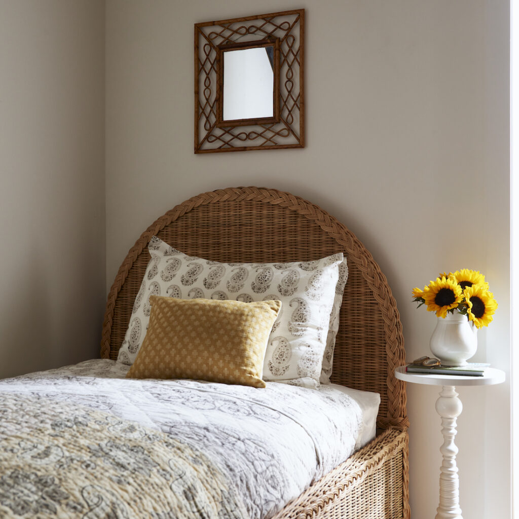
Beyond the office, you can see the sleeping loft.
The bed is Serena and Lily, the side table is Dunes and Duchess, and the bedding is Les Indiennes.
It took over a year to get everything in place, and another year for Phase 2 and the punch list.
More about Phase 2 to come! I have to thank my contractor, Tom Drain, for all of his incredibly hard work and support throughout the process! Without him, none of this would have been possible!
All photos by Jared Kuzia Photography. “Before” photos by Eric Roth Photography.

